Building fintech multiplayer
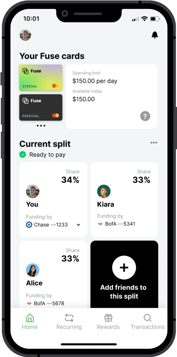
As the Founding Designer, I was responsible for leading the design efforts for Fuse, a cutting-edge fintech app that simplifies group payments and eliminates the need for settling up. My role encompassed all aspects of the design process, including user interface and user experience design for both the app and web experience, marketing materials, and branding.
Opportunity space
The opportunity for our product, Fuse, lies in the growing number of Americans living in shared households. With 79 million Americans residing in shared homes, and an additional 14.4 million living with non-family roommates, it's clear that there is a need for a better way to manage shared expenses.
Fuse was designed to solve this problem by providing a simple and easy-to-use platform allowing individuals to split payments in advance and avoid being owed later. By eliminating the need for constant Venmo requests and reducing the stress around shared finances, Fuse aimed to improve the relationships and living situations of roommates, couples, and many more.
How to Fuse
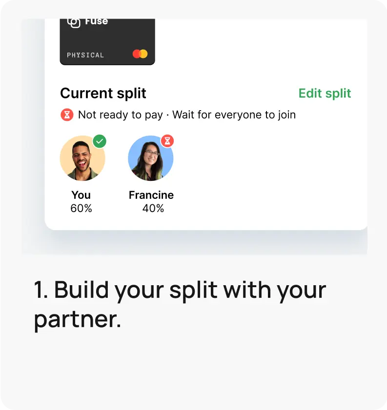
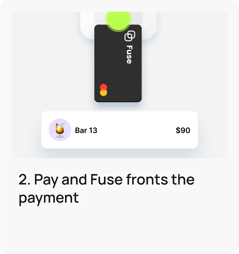
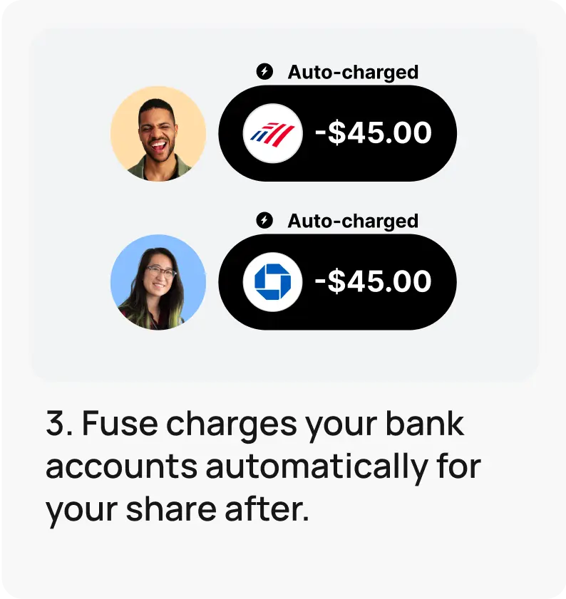
The main objective of this case
Onboarding and activation are critical for the success of Fuse. By creating seamless and user-friendly experiences, we can lower acquisition costs and increase lifetime value, driving growth and success for our company.
Research
To comprehensively understand the user's perception of our onboarding flow, we employed a multi-faceted approach that included analyzing drop-off rates per screen, collecting quality feedback from customer support conversations and phone calls, and conducting moderated user testing of the main flow.
We recruited participants who matched our target audience in terms of age and social situation, specifically individuals who regularly split expenses with a partner or roommate. To simulate the actual user journey, we began the moderated testing from the Appstore screen to understand how the information presented there may impact the user's further experience. The insights gained from this research were invaluable in identifying areas for improvement and informing the design decisions for the project.

Problems we have identified
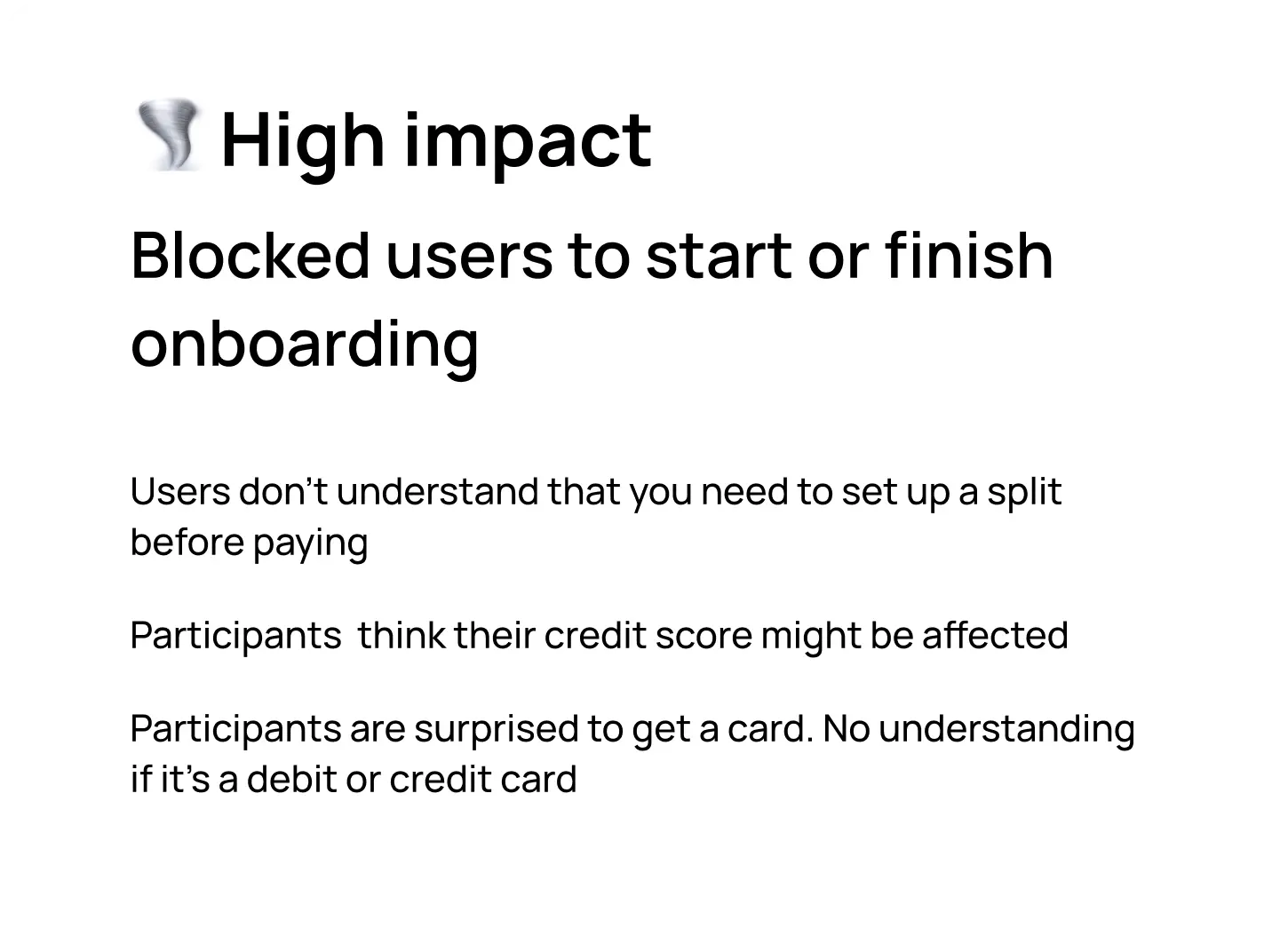
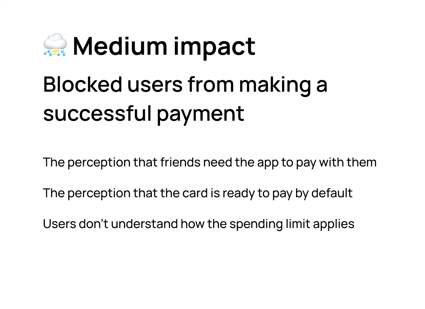
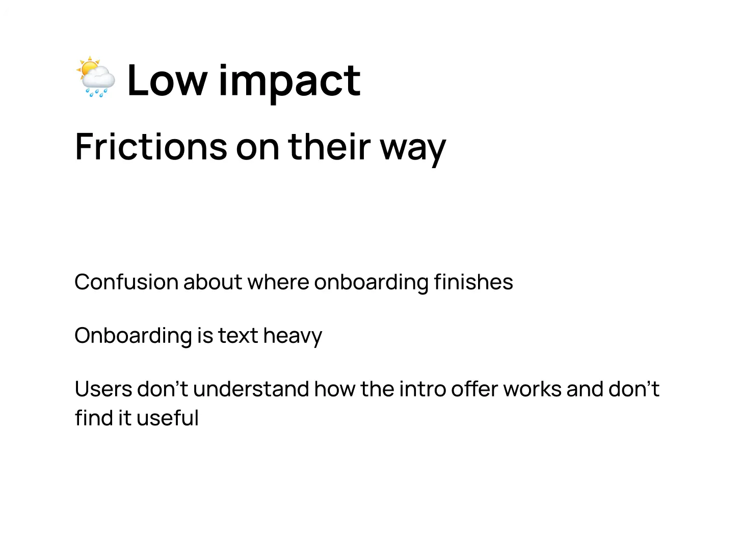
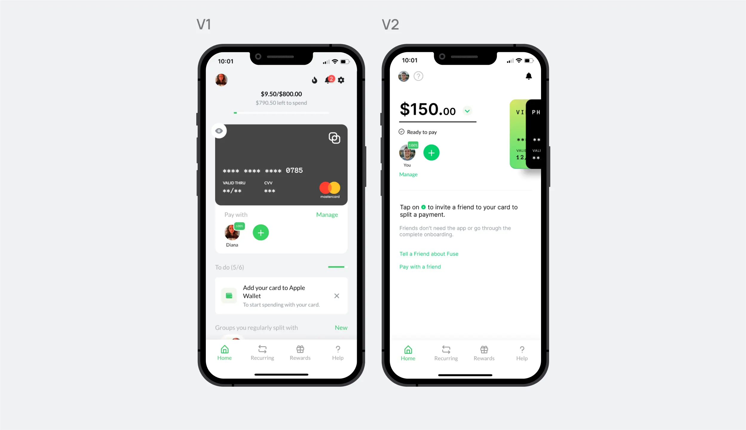
Home page redesign
The home screen of our app underwent a redesign to include a physical card feature, which was highly requested by users and could benefit the business by expanding payment options. However, during usability testing, we found that the redesign led to confusion for users regarding how the app works. For example, two cards on the screen disconnected the cards from the users inside the current split, and the card's appearance as "ready to pay" caused confusion, as solitary transactions made by first-time users were blocked for fraud prevention. This resulted in users being declined for transactions even if they were willing to try the product.
Requirements
Explorations
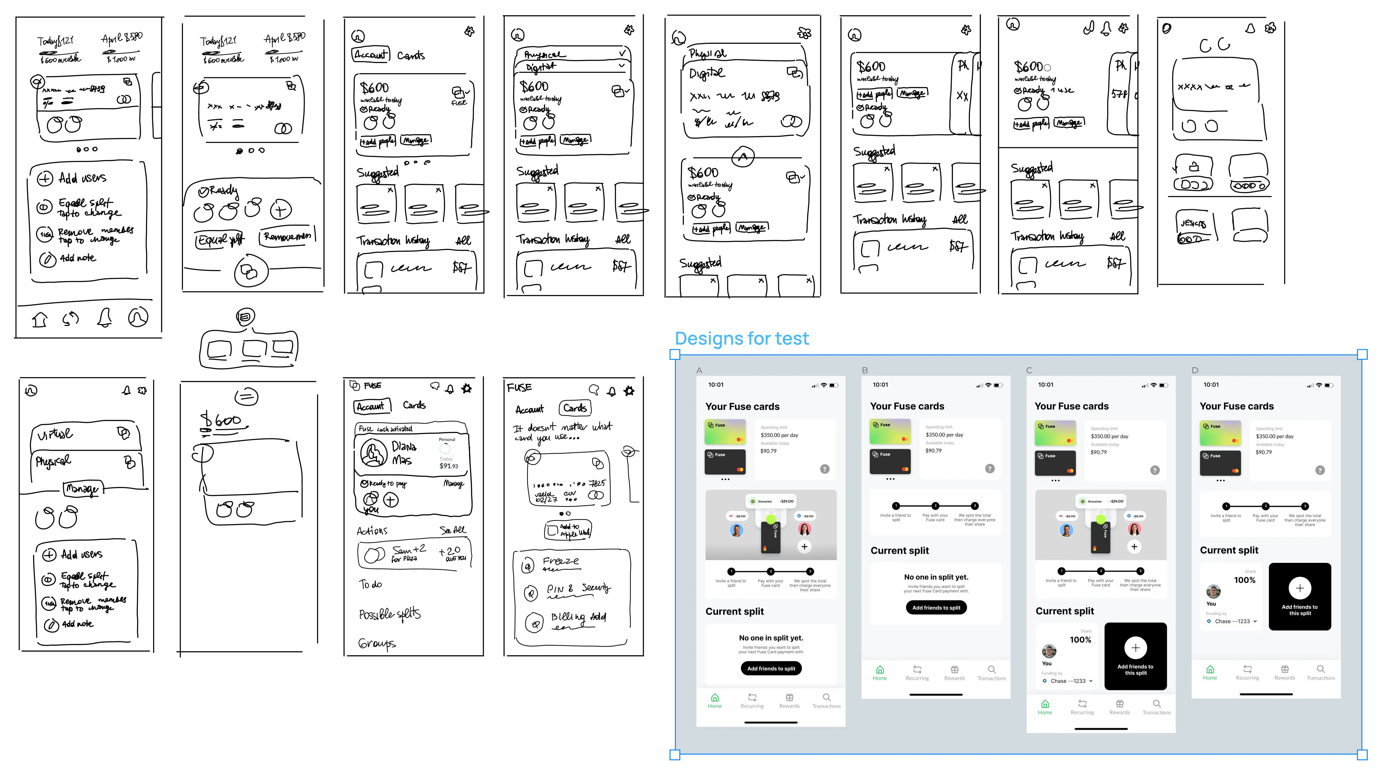
Based on our user research and requirements gathered, we identified four potential solutions to test through an unmoderated usability study. Each participant was presented with one version of the home screen and asked a series of questions to determine their understanding of the functionality of the app.
The 3 most important questions to us were:
- Did they understand we gave them a card?
- Did they understand the steps to splitting a payment?
- Did they understand we auto-charge everyone from their bank account after the payment?
To evaluate the effectiveness of the designs, we rated them based on the participants' understanding of them. The results of the study revealed that all four proposed solutions performed better than the previous design, with one design emerging as the clear winner based on the highest overall scores from our evaluation .
New home page
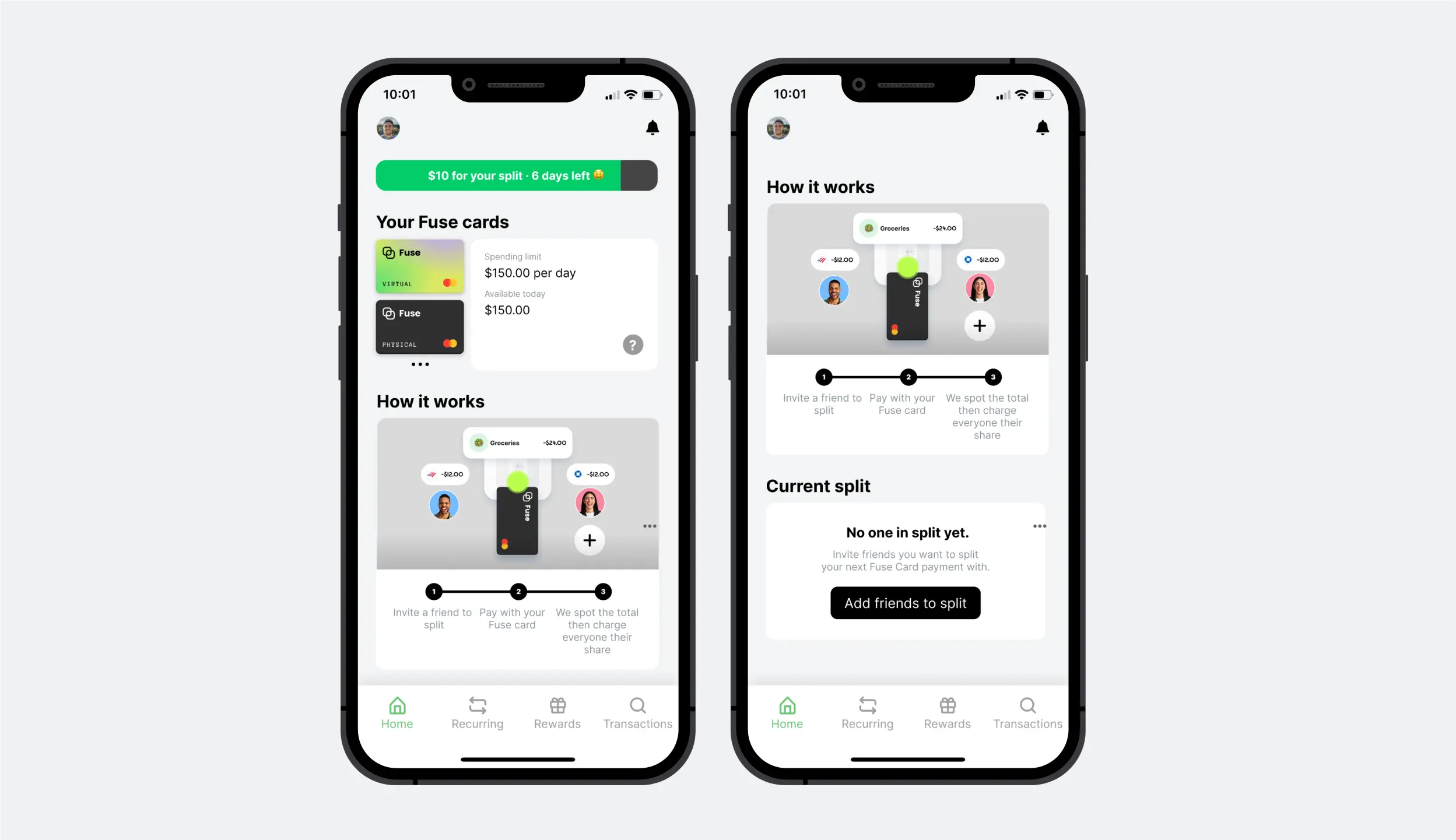
The new home page features two prominent cards that are clearly branded, enhancing brand recognition and user understanding. The "How to Fuse" section features an animation atop the written step-by-step description, as the animation performed exceptionally well during the user testing. The animation remains on the home screen until the user completes 3 successful splits. The redesigned version also includes a timer for the intro offer to create a sense of urgency. The redesign aimed to decrease the cognitive load on users by relocating less critical information and infrequently used features to other pages. Finally, the empty state of the current split now prompts action and discourages solitary payments.
Setting up a split
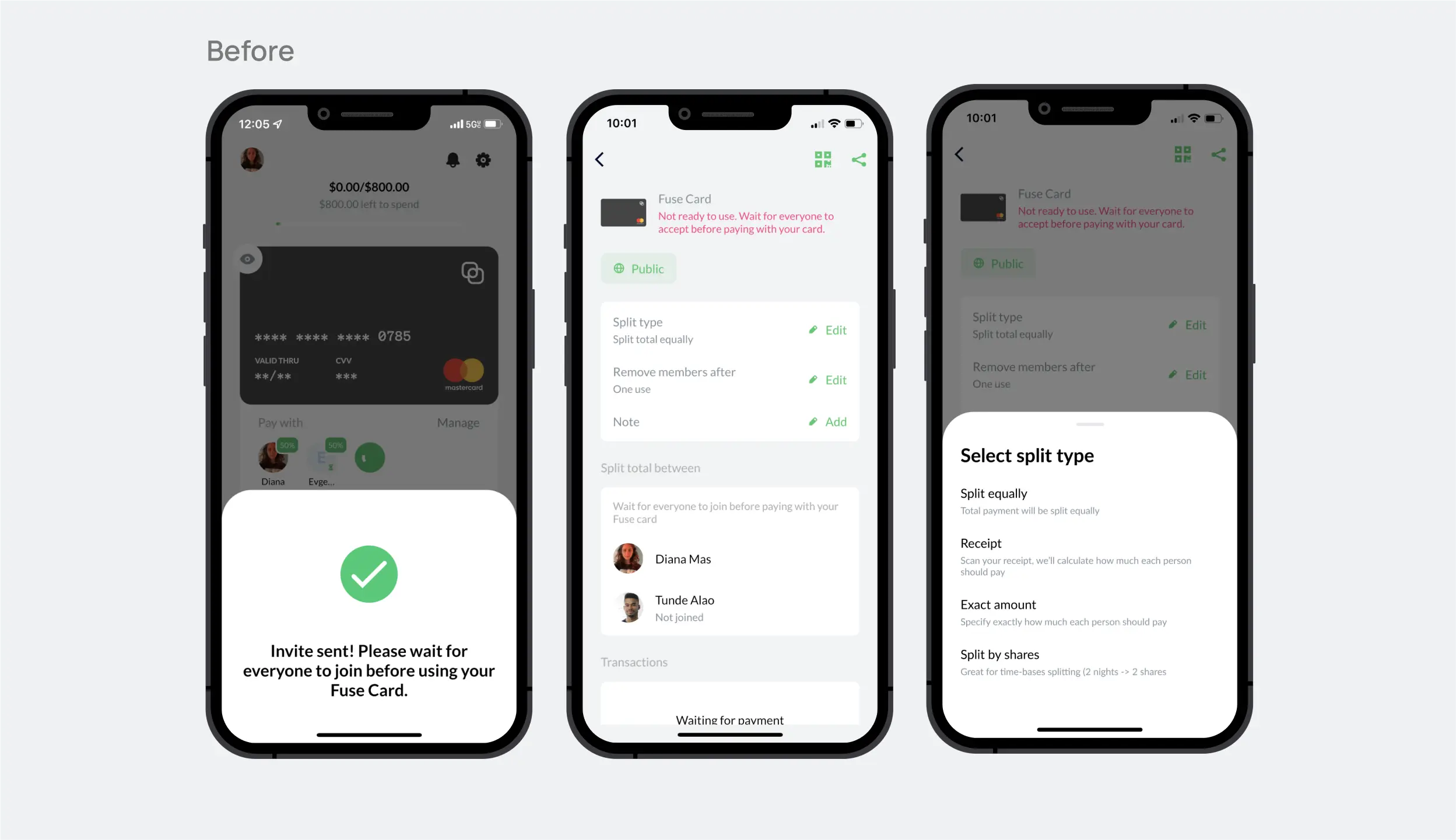
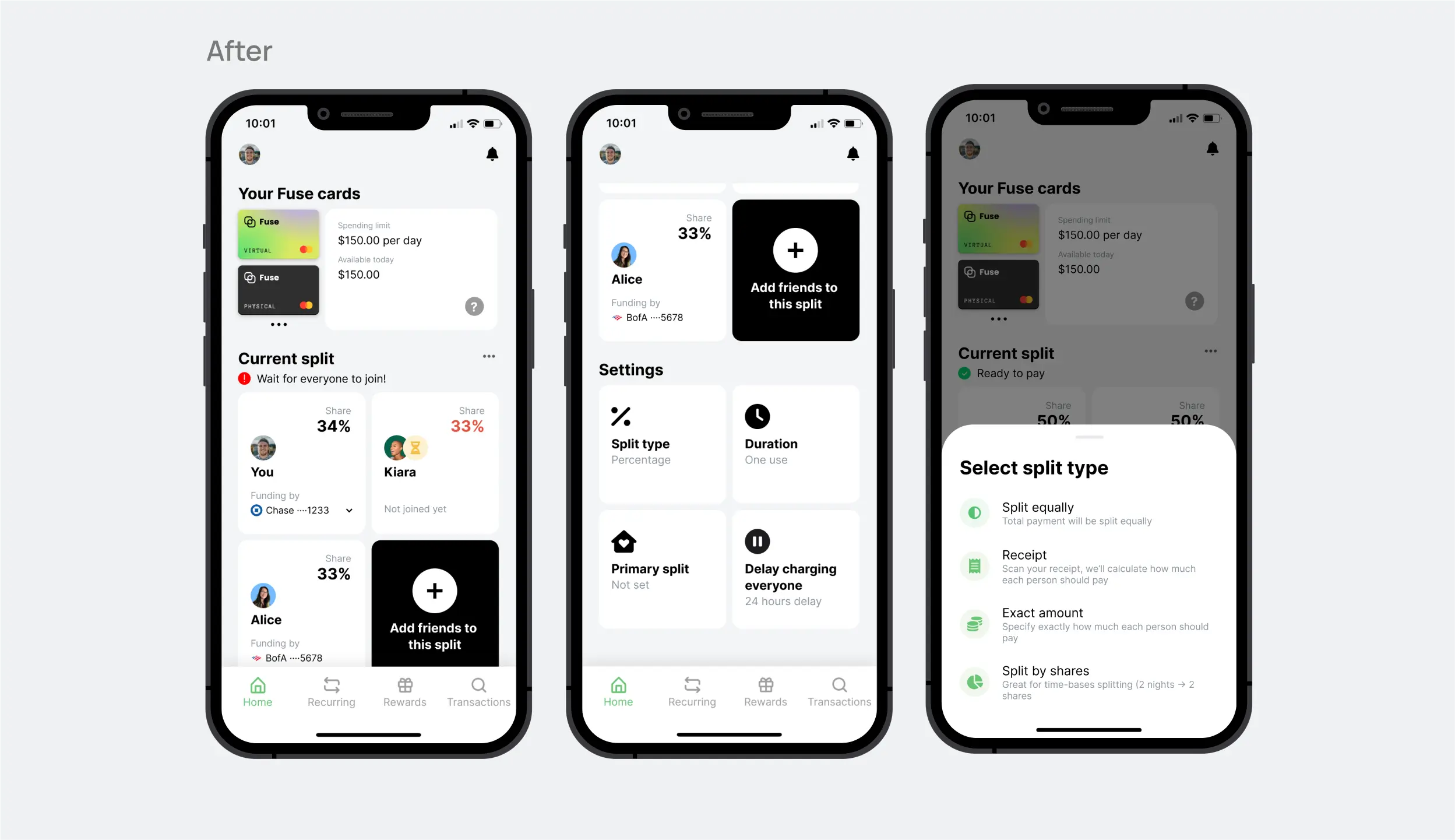
The core splitting feature underwent a redesign to be more self-explanatory. Key improvements included moving split participants and settings from the Manage screen to the Home screen, where they would receive greater visibility. We also decided to show a funding source; this way, users could better predict what would happen after the merchant will charge a Fuse card. Additional visual cues were added to clearly indicate when the card is not yet ready for payment, as previous alerts proved inadequate.
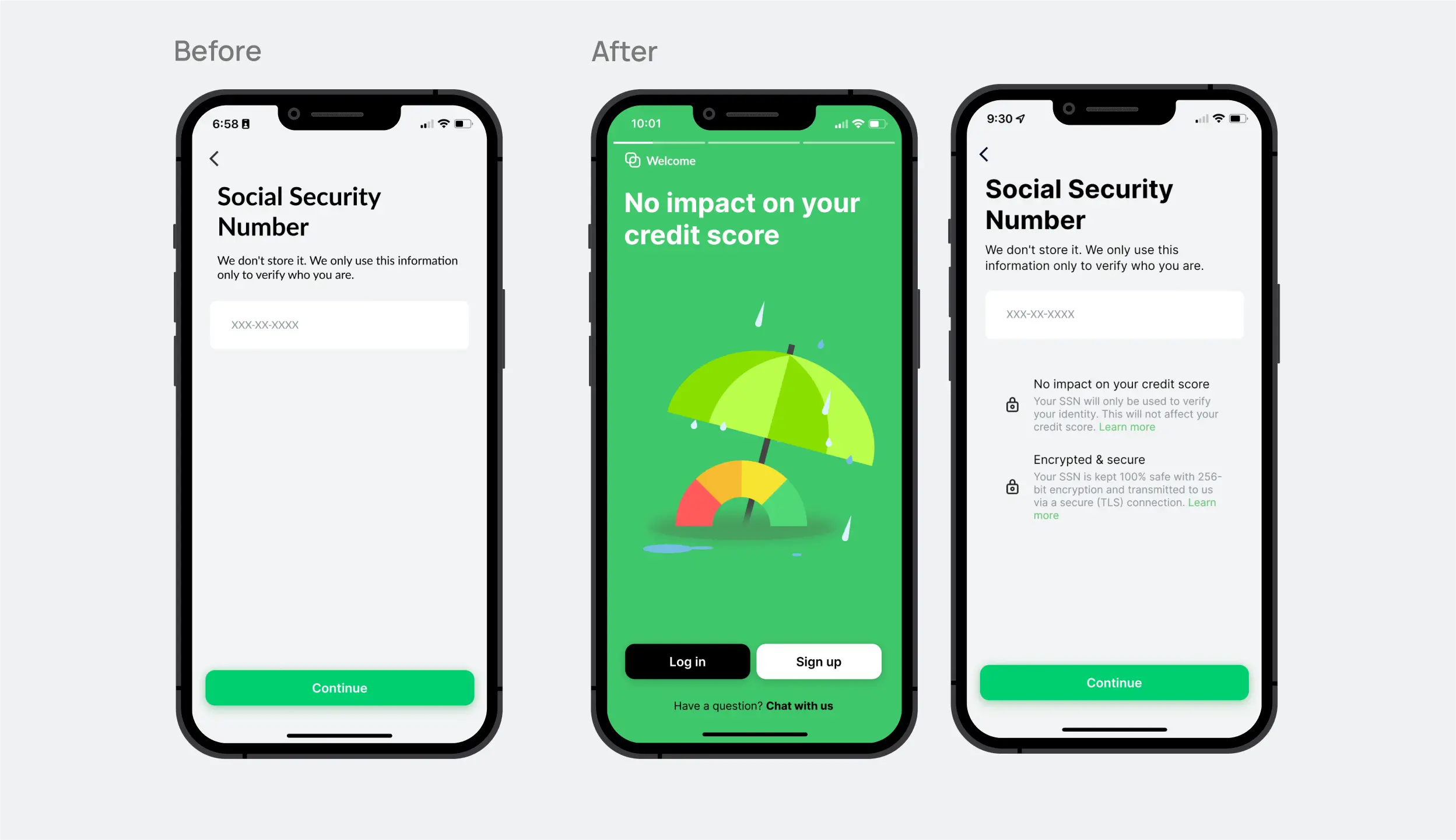
Credit score worries
To address concerns expressed by test participants that creating a Fuse account would impact their credit score, we added reassurances throughout the experience. We also added information on the topic on the Appstore and landing page to keep our messaging clear and consistent.
Focus on the card
We introduced the concept of a virtual card early in the experience to minimize any surprises for users. However, recognizing that not everyone needs a virtual card (to join friends' payments on Fuse, you don't need one), we added the option to skip the card creation and proceed directly to accepting an invitation.
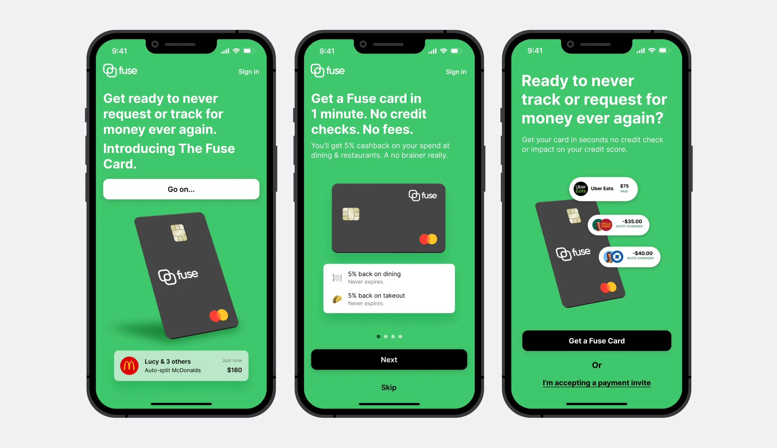
Appstore screenshots
Our Appstore screenshots emphasized the narrative of the card with no impact on the credit score. We also showcased common use cases, such as couples and roommates. Additionally, we addressed an issue identified during user testing by highlighting that friends don't need the app to participate in payments.

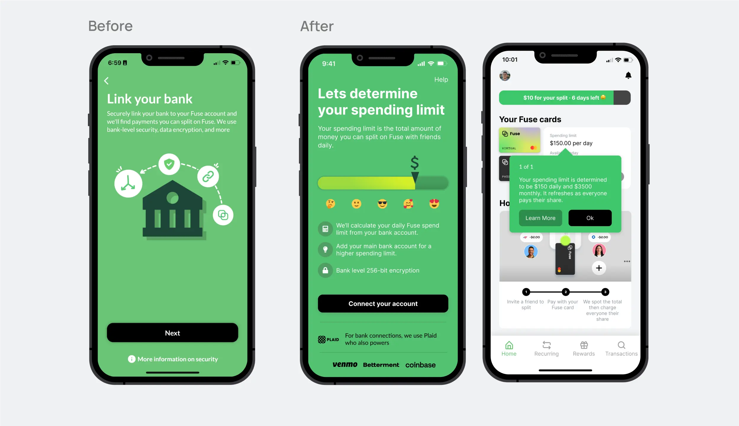
Spending limit improvements
We leveraged bank account balance information to set a spending limit for users. However, the onboarding step requiring users to connect a bank account was a significant drop-off in the flow. Additionally, users who had multiple bank accounts tended to join the one with the lowest balance, resulting in a lower spending limit. To improve the conversion rate for this step, we provided users with more information about why we collect this data, as well as how it is protected and used. Finally, when presenting users with a spending limit, we also aimed to clarify any confusion about how the limit applies.
Friends don’t need the app
We always supported the ability to join a payment session as a guest through the web and without creating an account. This made it easy for users to pay for a meal with friends or book a trip together without starting an account. However, even some of our most frequent users were unaware of this feature. So definitely, this perception was hurting our transaction frequency and customer acquisition.
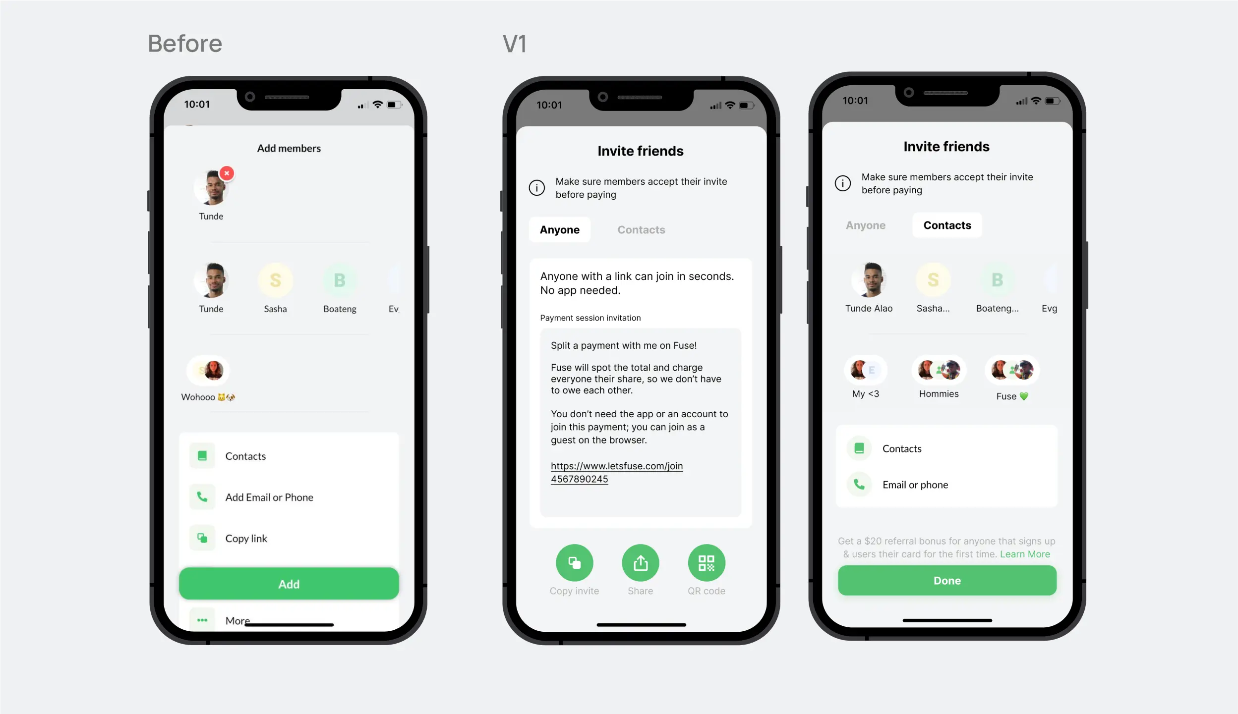
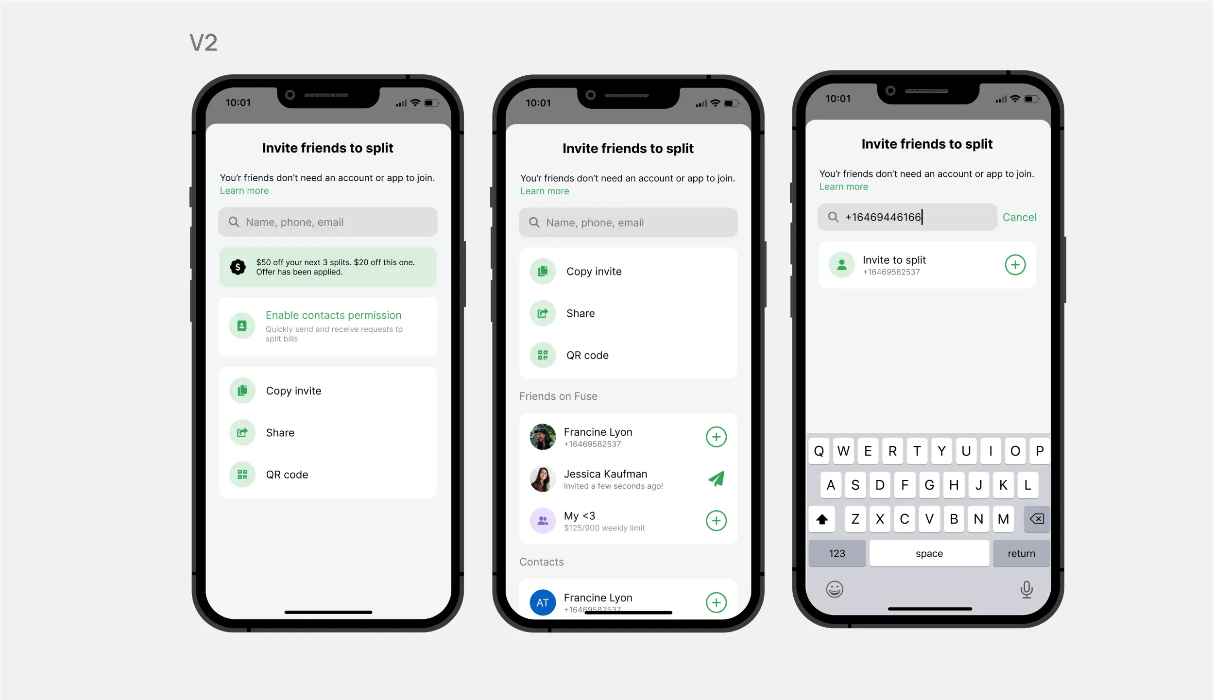
Add friends screen
Add friends screen became our first target. If users don't know they can split payments with people outside the app, they wouldn't. In the first iteration, we wanted to give more highlight on link sharing as it can give the user a visual affordance that all their friends will need to do to join is open a link. But the tab idea kept your friends and groups that you split the most far away and hidden. We streamlined the process in the final version by removing the tabs and incorporating a search function for faster navigation.
Join payment flow
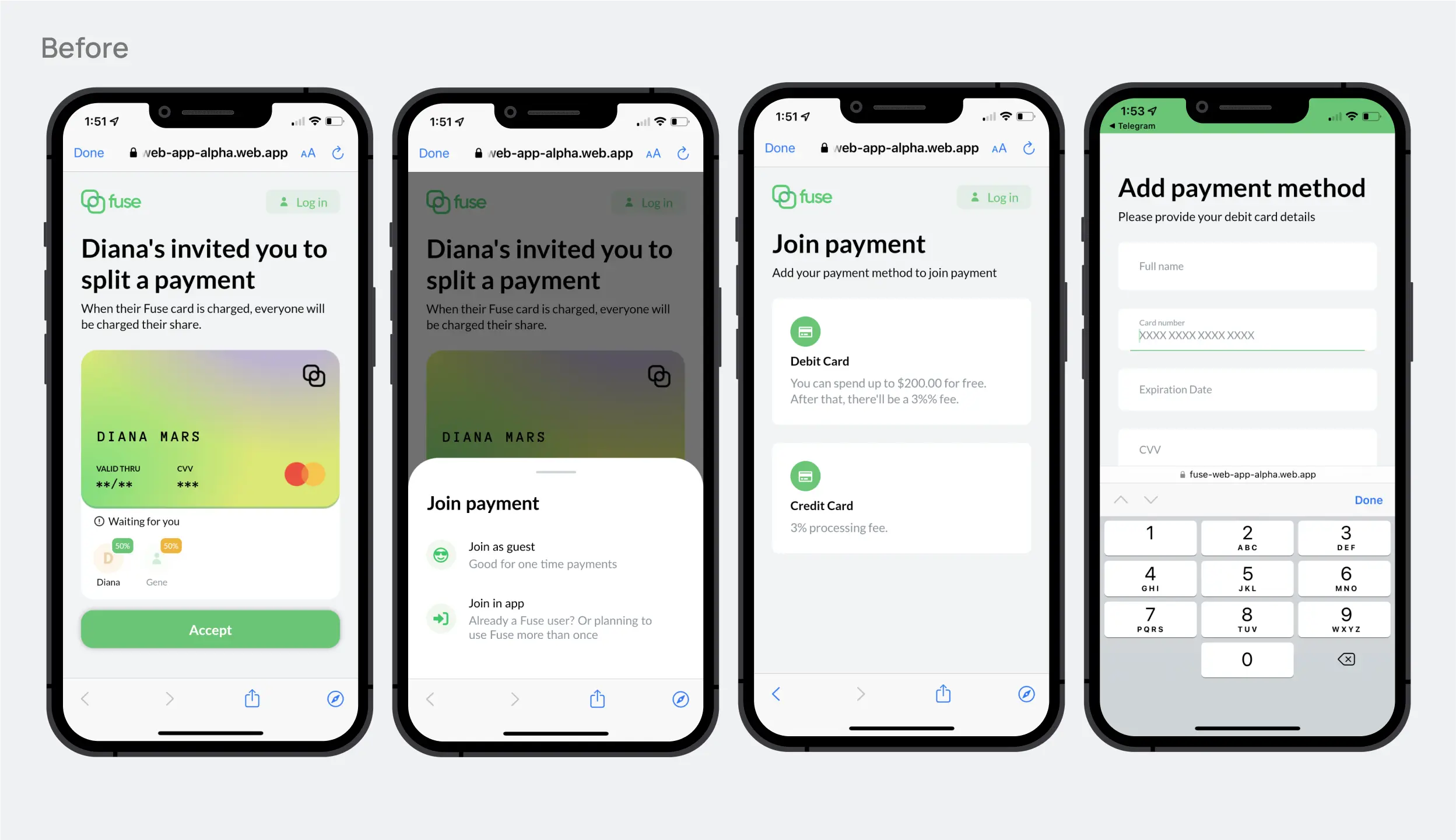
The second area we focused on was streamlining the process of joining a payment through the web. Previously, the flow was confusing and did not clearly indicate that you could join a payment without creating an account. Additionally, manually entering card information was time-consuming and tedious.
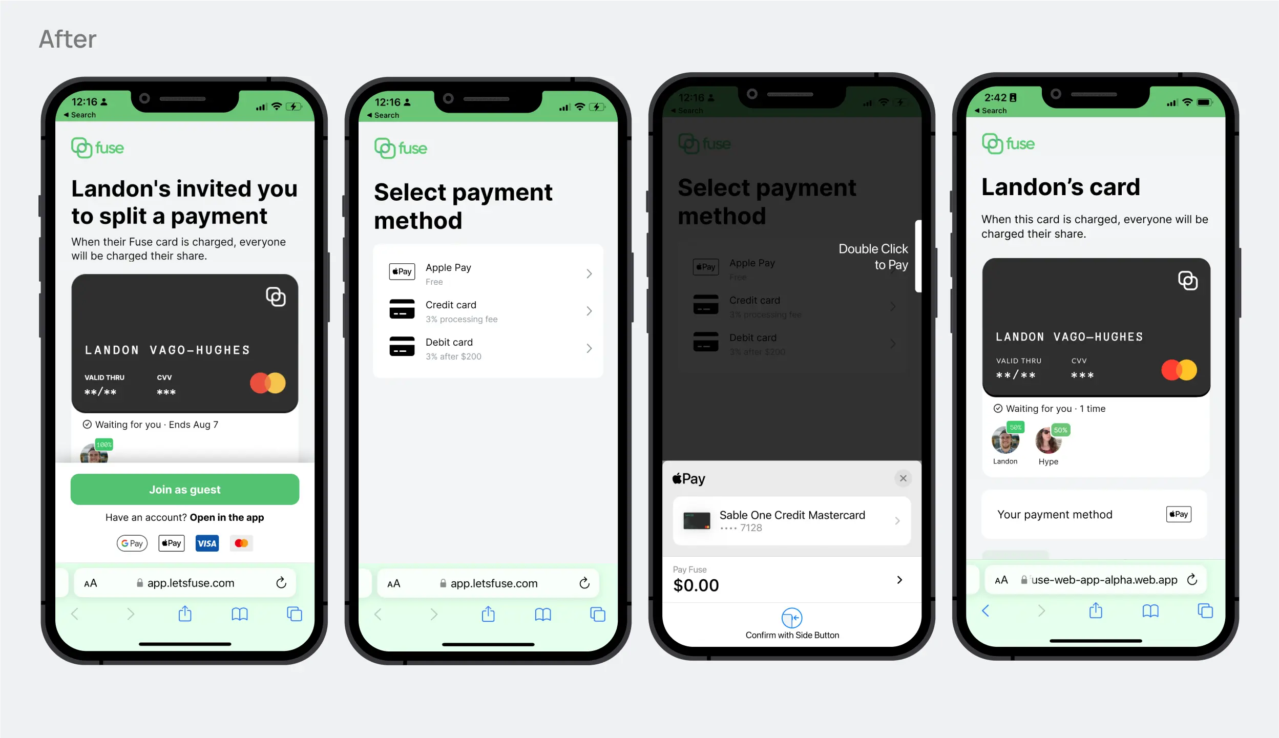
In our redesign, we made the guest option the default for joining a payment. Additionally, we added Apple Pay as a payment option, streamlining the checkout process and making it a breeze to join payments on Fuse.
Results
The results of our redesign efforts were positive. By improving the onboarding journey, we were able to keep more users engaged at each step of the sign-up process. The updated home page and main flow also helped users understand how the app works and made it easier for them to make their first payment. Finally, our changes to the guest payment flow resulted in a significant increase in the number of users making transactions with guests and a boost in the total number of transactions.
Summary
My time at Fuse was precious and formative. Initially, I was intimidated by the amount of work and responsibilities, but I soon realized that it was the perfect opportunity to grow and develop my skills.
I gained hands-on experience in customer service, which gave me a better understanding of our users' needs. I was also able to connect with users and gather valuable insights through my participation in the Fuse communities on Discord and WhatsApp, as well as through conducting both moderated and unmoderated usability studies as part of my UX research work.
I was involved in the creation of landing pages, marketing assets, and a design system from scratch, as well as conducting QA, which allowed me to sharpen my design skills. Additionally, my collaboration with other departments helped me become a stronger team player.
Overall, my experience at Fuse was both professionally and personally enriching. It allowed me to develop my UX design and research skills and be part of a dynamic and innovative company. I am grateful for the opportunity.
