Ordering flow for a jazz club
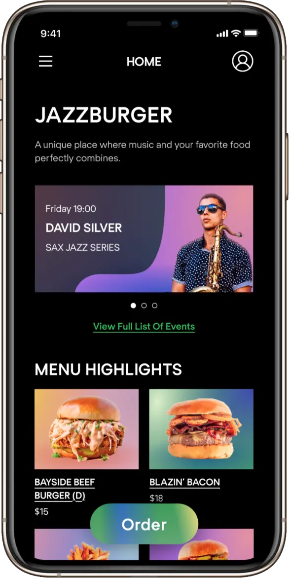
Solo study project for Projector creative & tech online institute. The task was:
Strategy
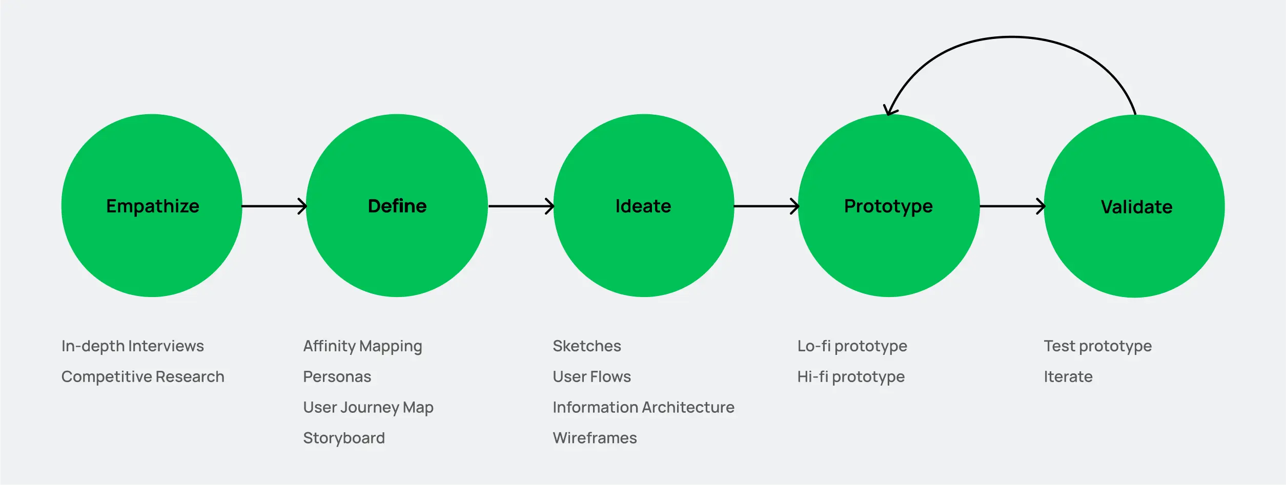
I built my work on the design thinking framework to create solutions that address a real user problem and are functional and affordable. I love how this approach keeps a user front-and-center.
Challenges with delivery
The Projector UX Design course presented a unique challenge, as I was based in the US while my instructors and classmates were in Europe. Furthermore, being new to the country and city, as well as navigating the pandemic, added to my difficulties in creating a website for a burger restaurant in New York. This resulted in gaps in my understanding of local culture and behavioral patterns.
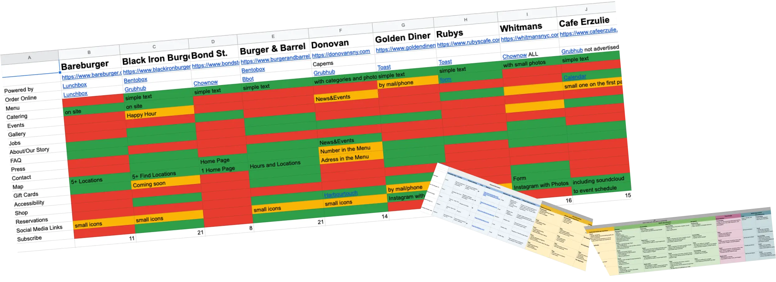
My competitor analysis revealed some interesting insights - I found that local restaurants in New York do not offer delivery but rely on partners like Grubhub to handle that aspect. The menu pages on their websites often lacked images and were powered by other companies. Unfortunately, the ideas that worked well in the Ukrainian market were not as promising in New York, as the cost of having a personal delivery service was prohibitive for non-chain restaurants.
In-depth interviews
While my peers were making headway with their projects, I faced difficulties in setting my goals. To gain a deeper understanding of the local market, I conducted in-depth interviews with 20 to 35-year-old New Yorkers of different genders. My aim was to gather insights into the regional food ordering, delivery, and table reservation market, specifically in the realm of burger ordering, and explore the possibility of combining food with live music events. All interviews were conducted in person and lasted for one hour. I also ordered food with the participants using their preferred platforms (Grubhub and Caviar) and treated them to their preferred food as the incentive.
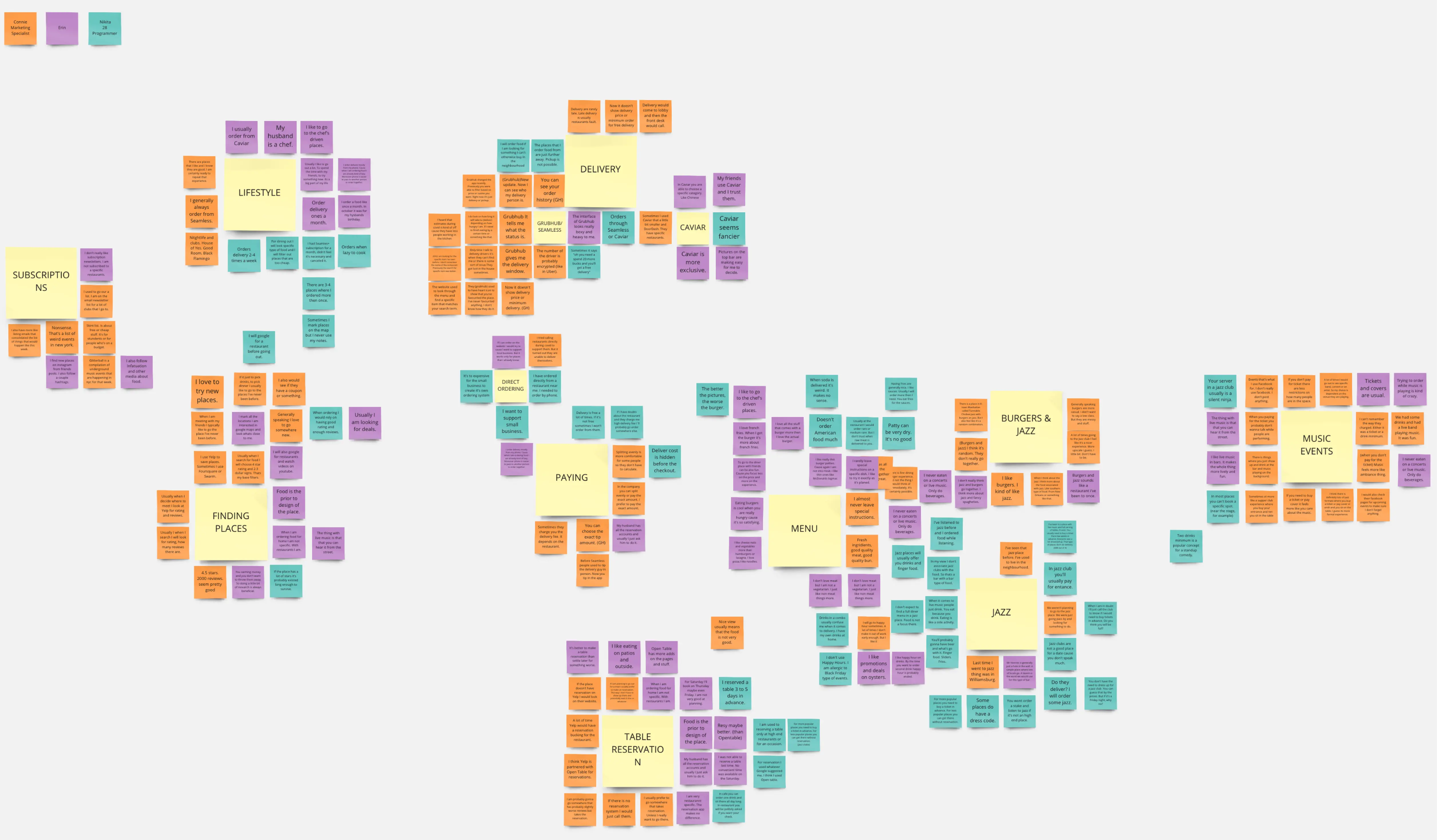
The participant responses were organized using the Affinity Diagram method. I also had the opportunity to create an Empathy Map, although it was not as informative as I had hoped. Nonetheless, these interviews provided valuable insights that allowed me to answer my research questions and gain a deeper understanding of the different aspects of the market.
Interview insights
Refined project goals
Upon discovering that a delivery website would not be feasible, I reassessed the project and identified a new challenge to tackle. The findings from the in-depth interviews indicated that ordering food while music was playing was a struggle for users at the burger restaurant that hosted music events. Additionally, the participants were comfortable with ordering food online and paying in advance.
Additionally, this would minimize unnecessary social interactions and increase safety for guests during the pandemic.
Defining user personas
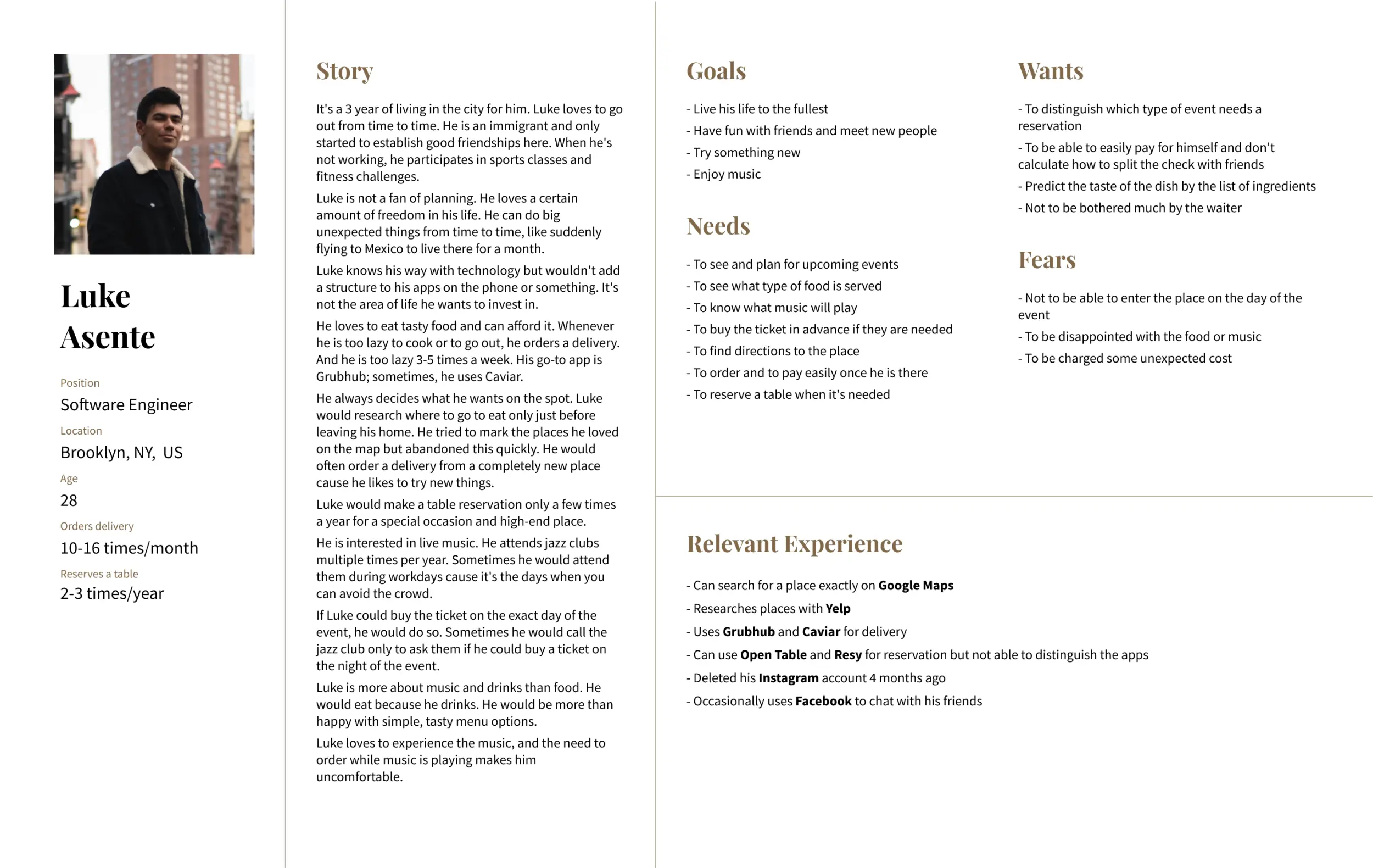
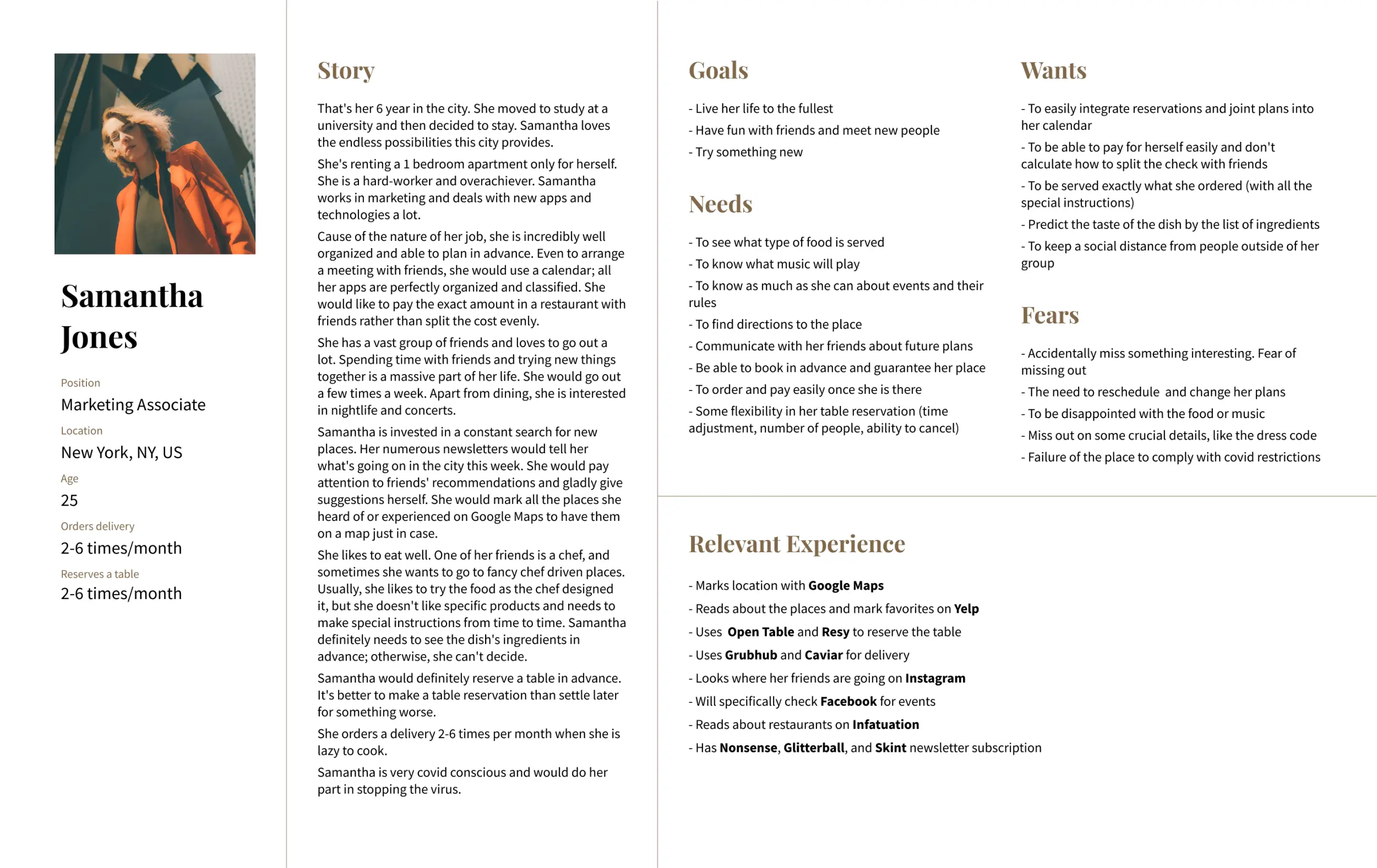
To accurately represent the target users of my project, I created two in-depth personas based on the insights from my interviews. The first persona was a new-to-city immigrant who was passionate about music, while the second was a highly organized and socially active individual with allergies. The key difference between these personas was their organization level and the required information and features. Finally, I thoroughly analyzed their goals, needs, wants, fears, and technological proficiency to create comprehensive and detailed personas.
Storyboard
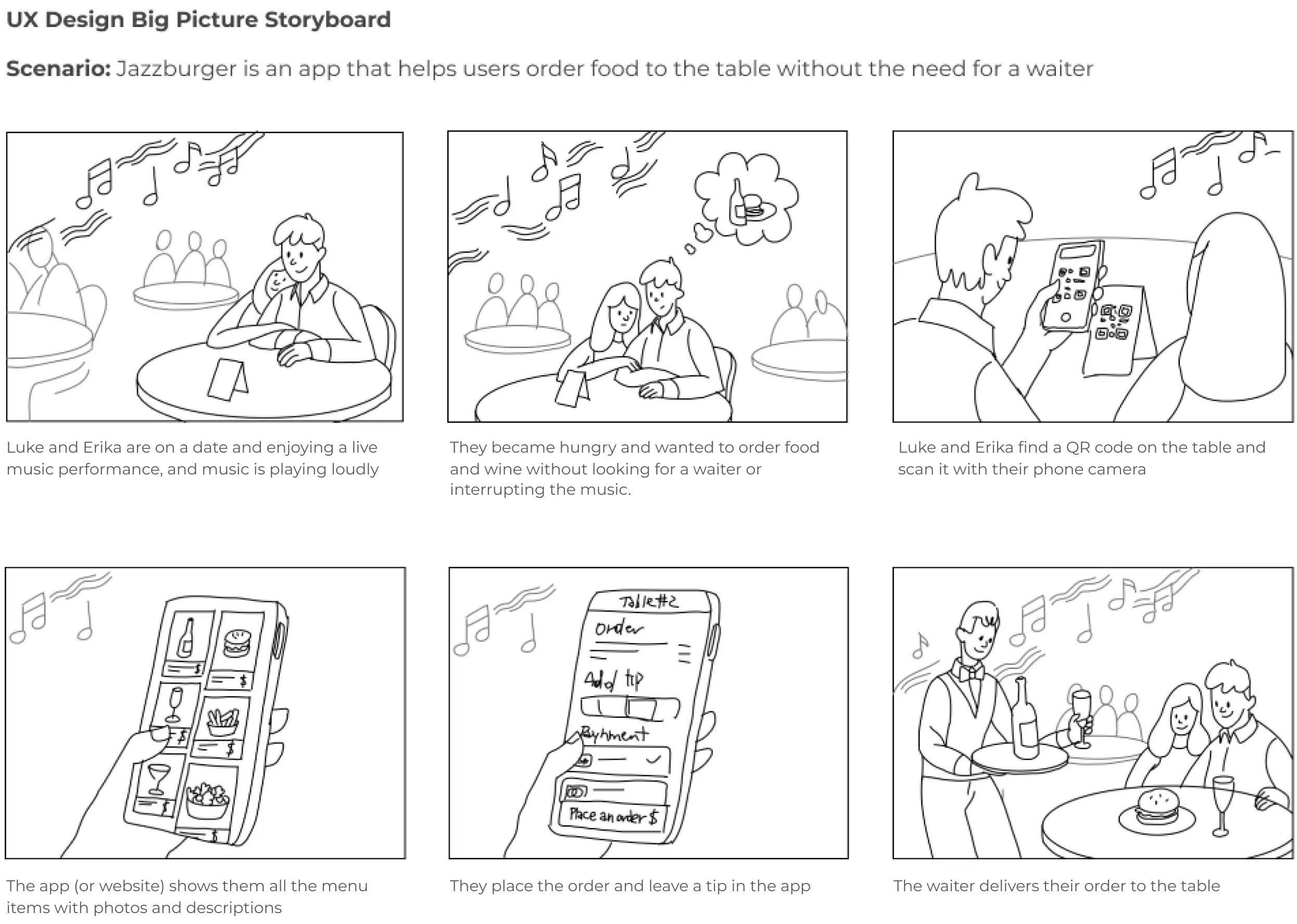
I developed a comprehensive storyboard to bring the use case scenario of my product to life. This allowed me to gain a deeper understanding of the context and enhanced my imagination of the situation.
User journey maps
My personas served as a base for two user customer journey maps — one for ordering to the table and the second for table reservation. I evaluated the customers' tasks, organized touchpoints along their journey, and identified opportunities to enhance the experience by minimizing negative emotions and thoughts. The journey maps provided a comprehensive view of the customers' interactions with the product.


User flows
My research served as the foundation for creating user flows. In the flows I consider not only a successful scenario but also error handling, the option to order with or without an account, and other vital situations. This information helped me define the necessary features of the product.


Paper wireframes & IA
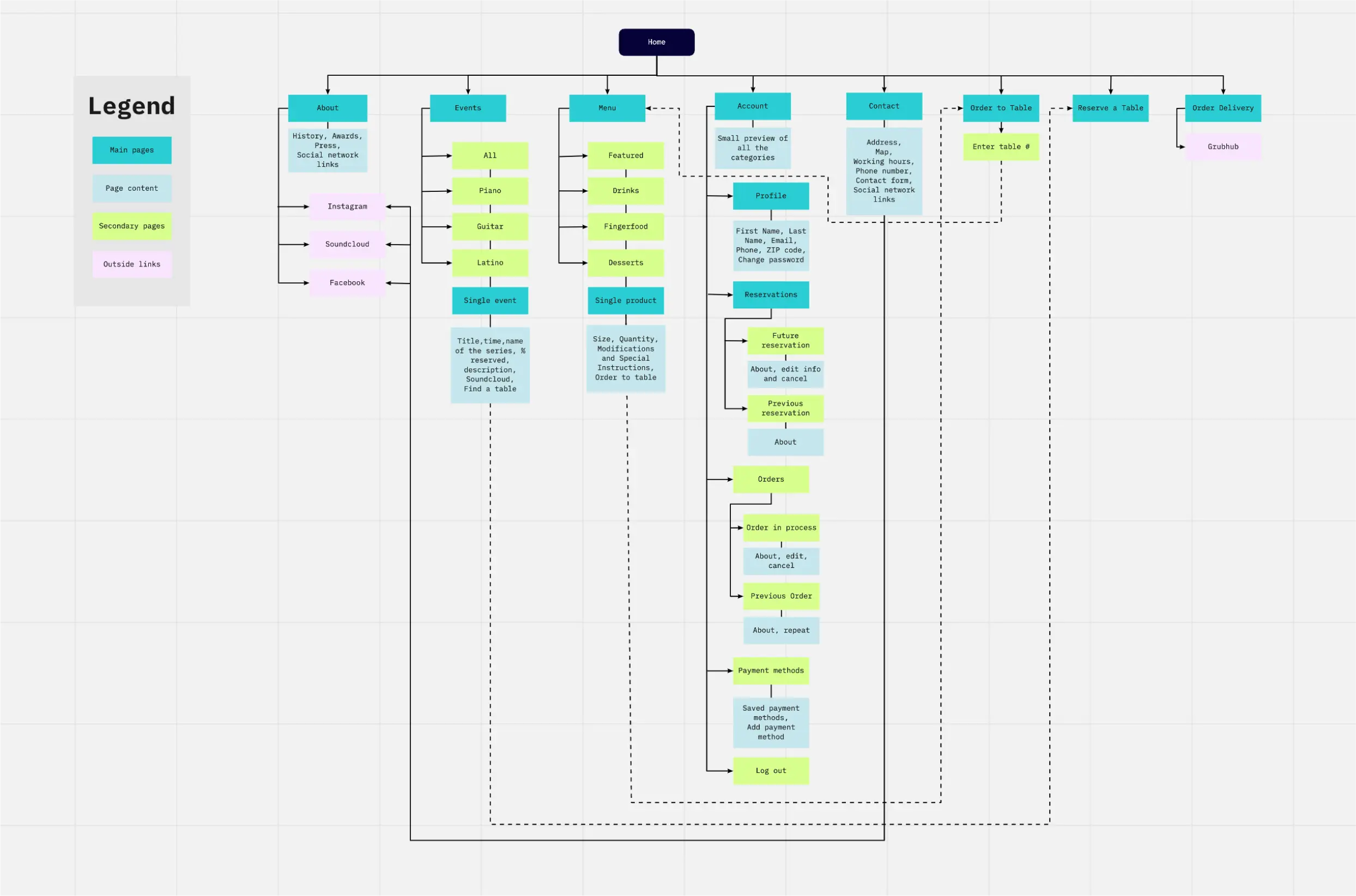
As I already knew the user's flow, now was a time to sketch it. The focus was on visualizing multiple screens and flows, including the option to start from a QR code or manually enter the table number. Particular attention was paid to designing an effective representation of the menu. I also created a mid-fidelity information architecture tree to clarify the app's structure.

Low-fidelity mockups
I created low-fidelity mockups considering the two ways users would access the flow, either through the app for regular customers or through the mobile web for table QR code scans.

Usability study
In pursuit of creating a seamless ordering experience, I conducted two rounds of user testing, starting with wireframes and then with a hi-fidelity prototype. These studies allowed me to identify and address key issues that were hindering the flow.
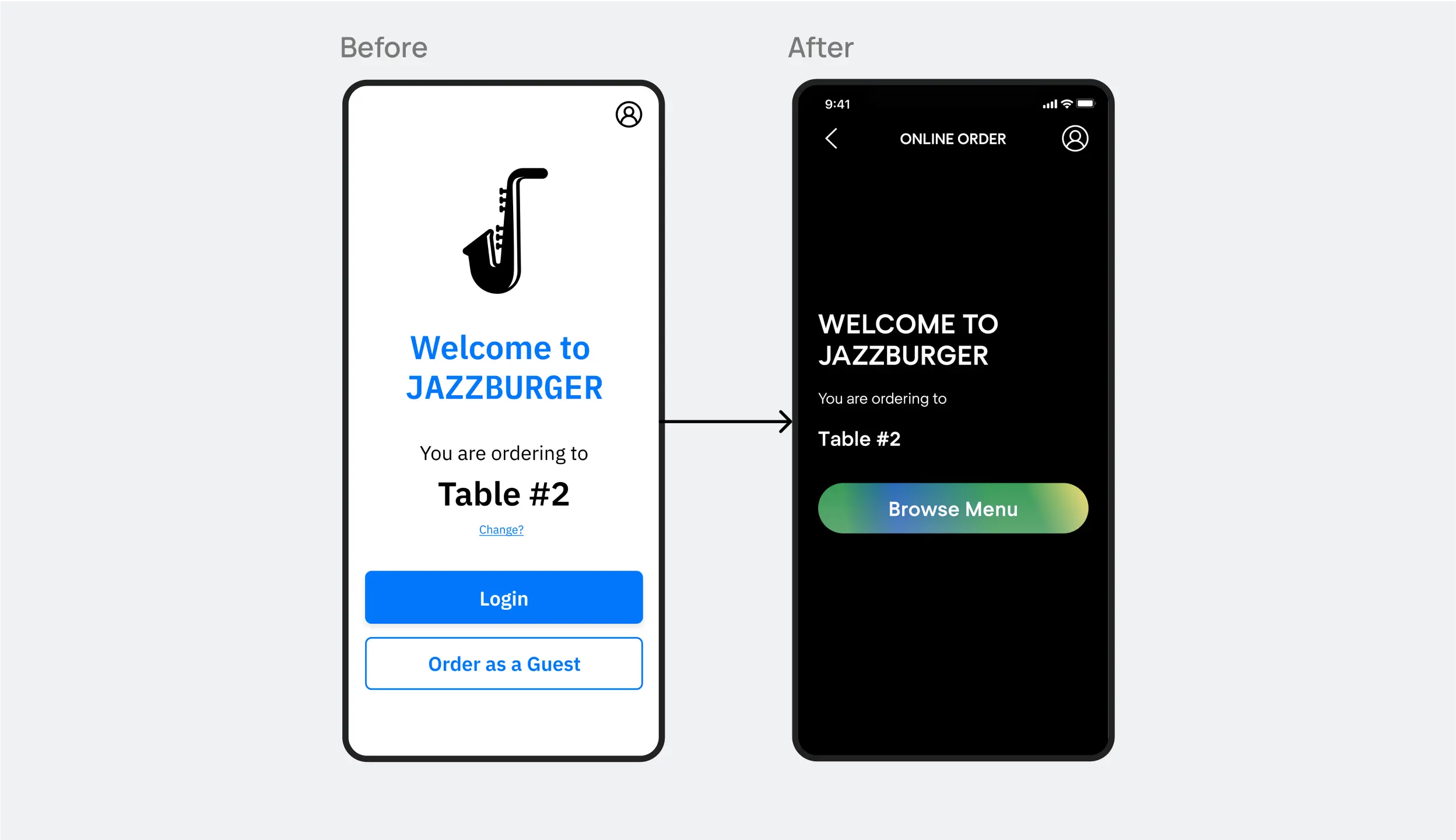
Initial designs required users to provide their information before browsing the menu. However, after the usability studies, I revised the flow to allow browsing without any commitment.
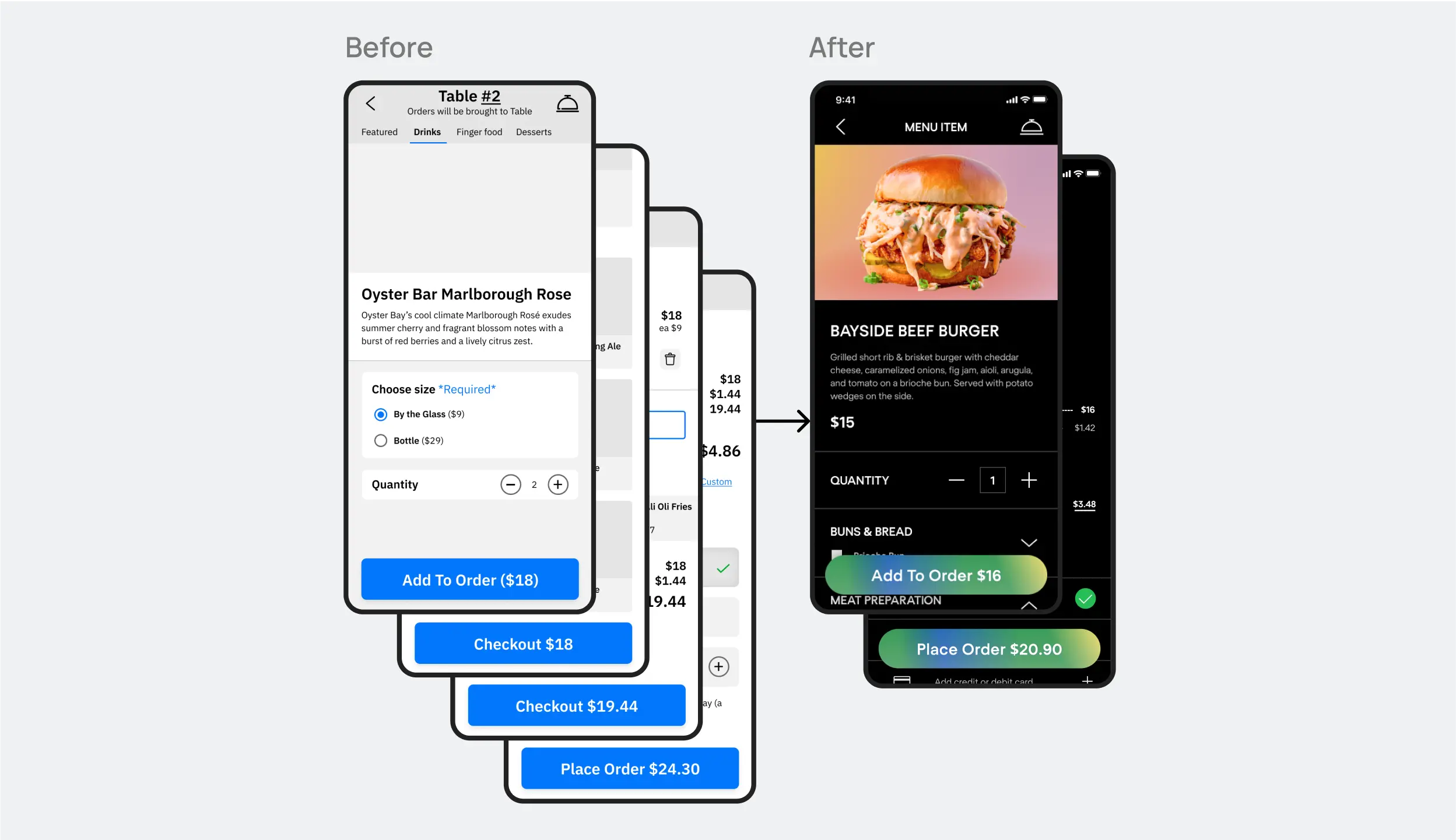
Growing cost on buttons was confusing and even scarry to users, so I modified the flow to include the price on buttons only in most essential steps: when a user adds a dish to his cart and at the final stage of the checkout.
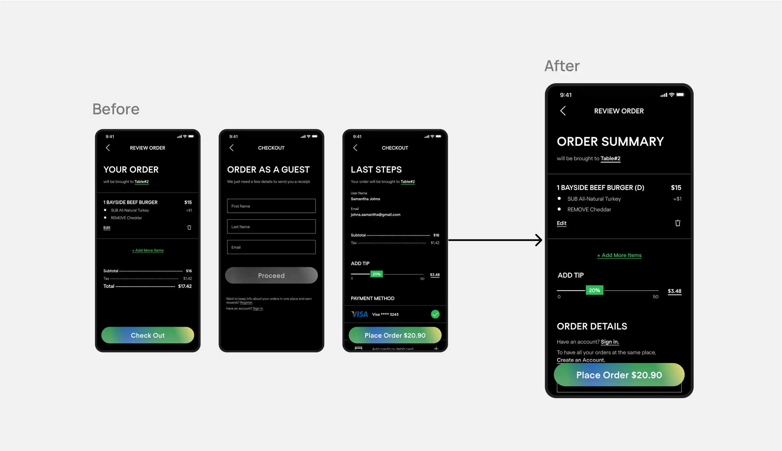
The second round of testing revealed frustration with the checkout process. To improve the flow, I combined the "Your order" and "Last Steps" screens into one "Order Summary." Given that many of my users are likely first-timers, I also simplified the ordering process for guests.
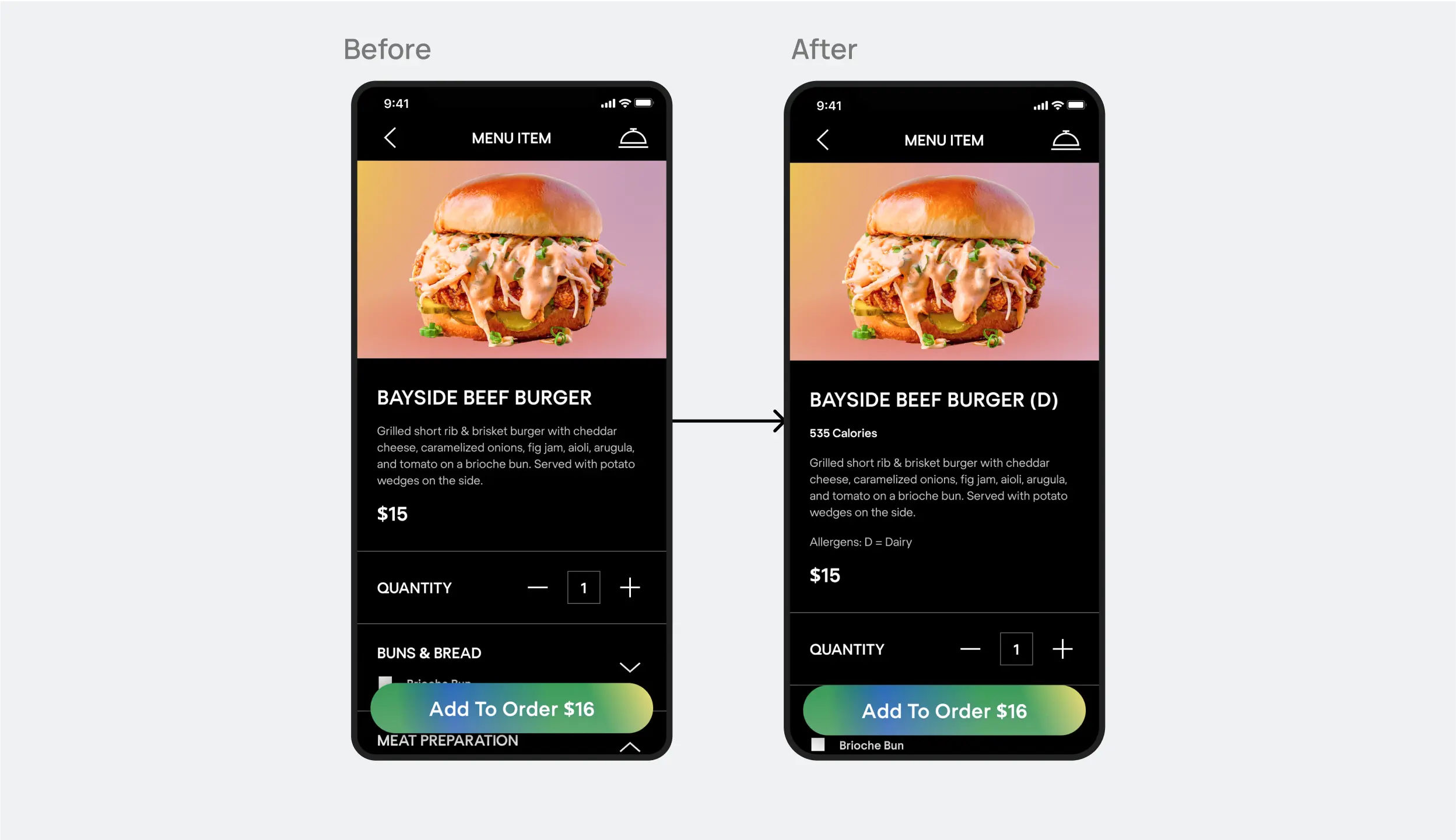
User testing showed that our product page was missing important information about food allergens and calorie values. To better serve our customers, I updated the design to include this information.
Sticker sheet
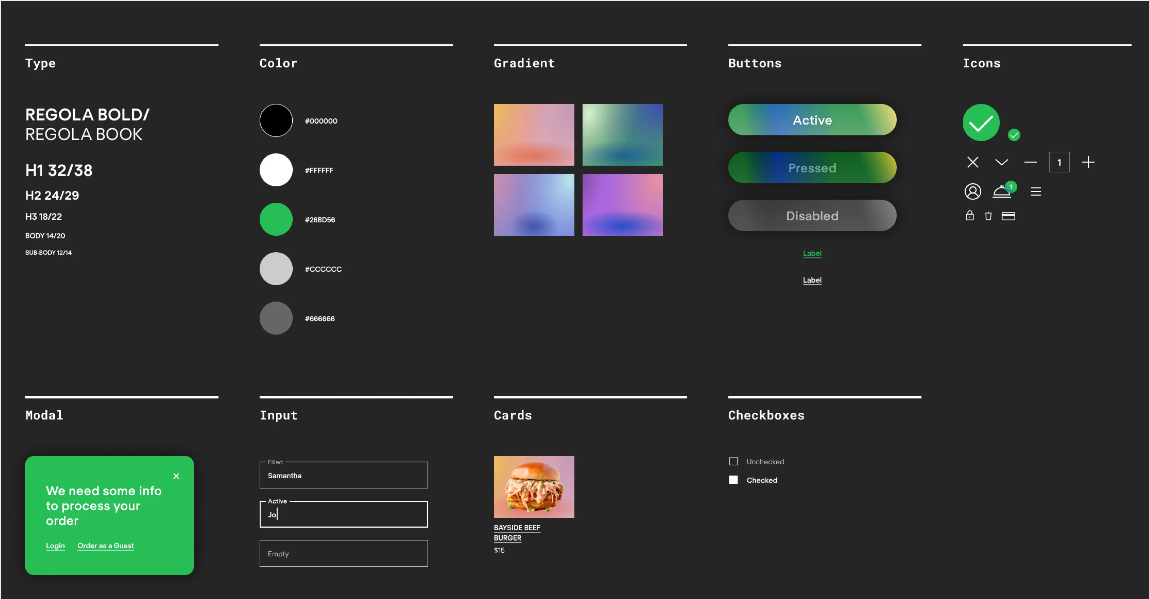
I opted for a dark theme for the web and app to create a visually comfortable ordering experience for users. This decision was informed by the likelihood of users ordering from dimly lit restaurant locations during musical events. To enhance the user experience, I made all call-to-action buttons bright and easy to differentiate. Additionally, I underlined all clickable elements to showcase their affordance. A series of gradients for menu items helped me to differentiate the brand and make it memorable.
Summary
This project was a unique opportunity for me to design for a new market, which was both enjoyable and educational. The process reinforced the importance of design thinking, a framework that prioritizes user needs and iterative design. Throughout the project, I remembered that initial ideas for the app are just the starting point and that usability studies and peer feedback play a critical role in shaping the final design. Adopting a design thinking approach allowed me to continuously test and refine my ideas, leading to a product that better serves the users' needs.

