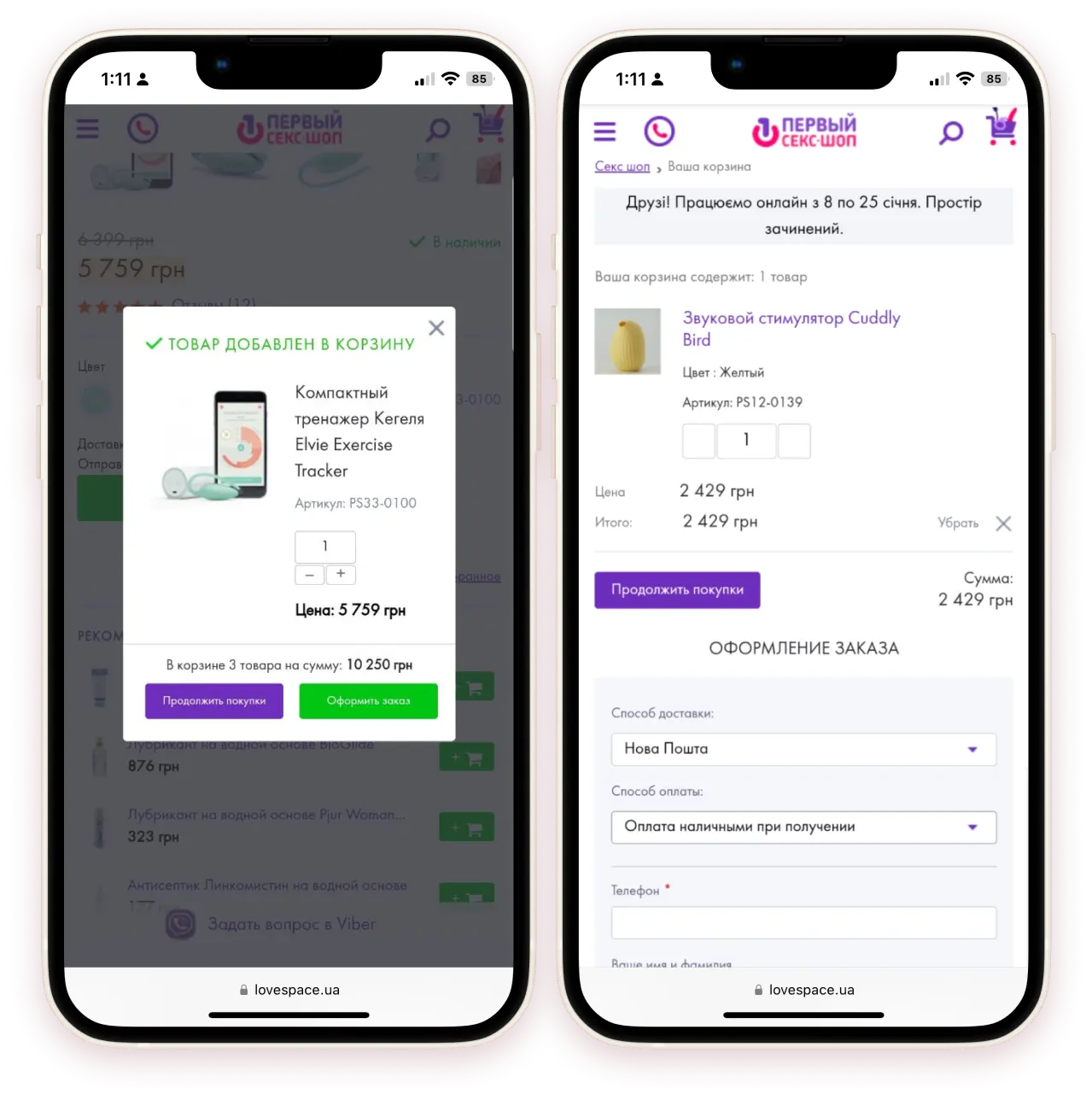
Transforming the sexy mobile e-commerce experience
Client
The client, Lovespace (formerly known as First sex shop), is a hub for all things sexual. With a decade of experience in the Ukrainian market, they have established themselves as experts in the industry. Lovespace's goal is to remove the stigma surrounding sex in Ukraine, and they do so by providing educational events and classes, an informative YouTube channel, and even a lecture room within their physical showroom. Although they offer a wide range of high-quality love goods, the company focuses on creating a welcoming and open environment for their customers.
Strong points
- Impressive general branding
- A commitment to kindness and inclusiveness
- A dedicated and motivated team
- Exceptional customer support
- A loyal customer base
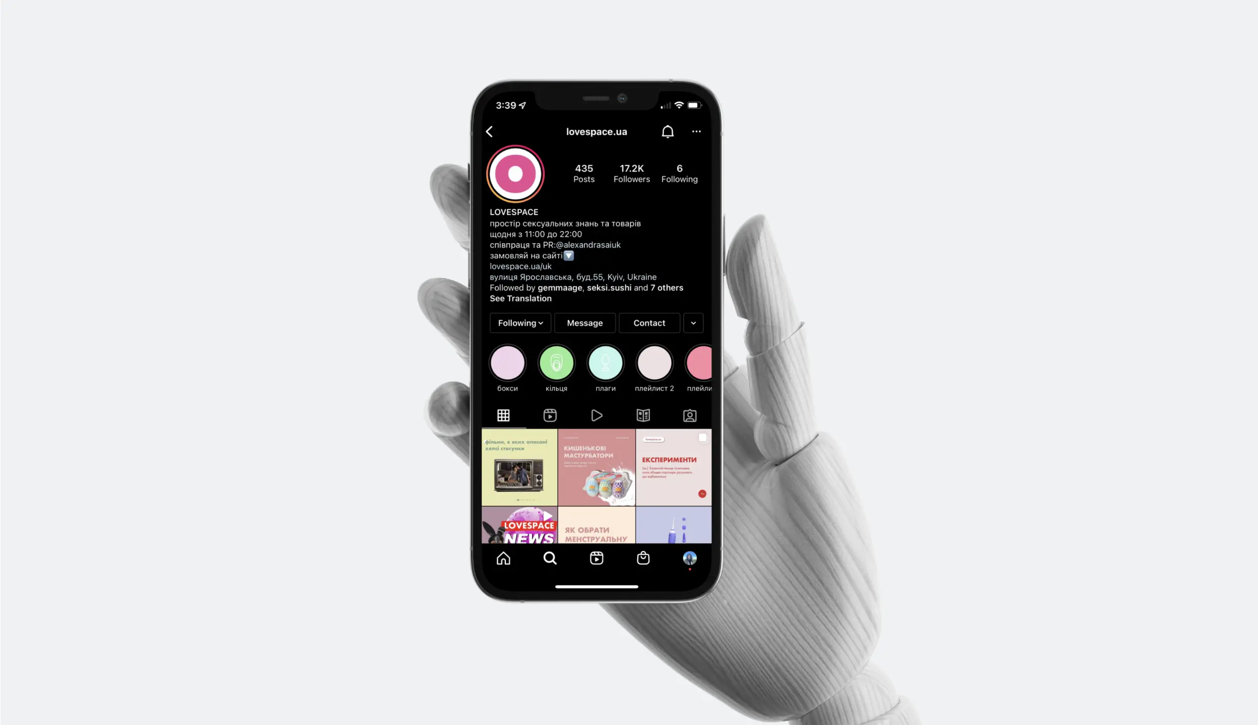
- An attractive and active Instagram page.
Problems and weaknesses stated
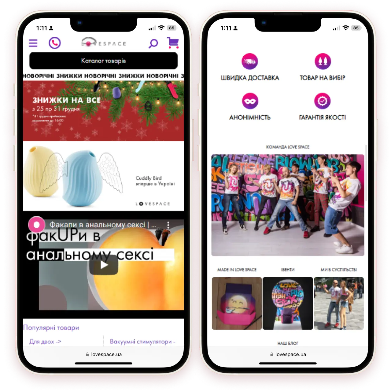
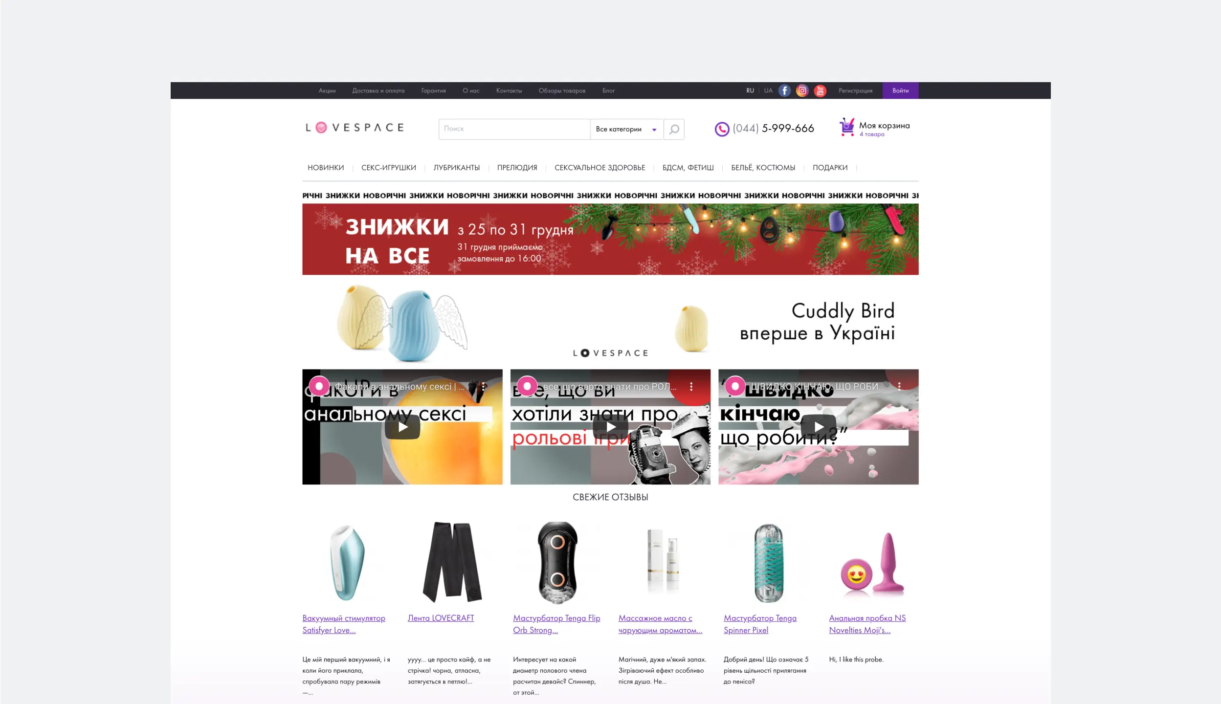
- The website design is outdated, resulting in a disconnect between the aesthetic of their Instagram page and the checkout process.
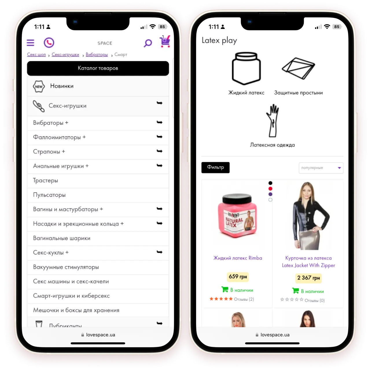
- The website navigation is overly complex and cumbersome.
- A high rate of customer abandonment during the checkout process.
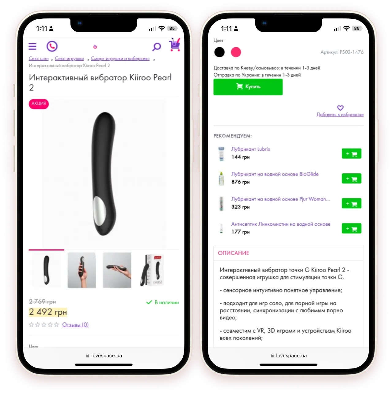
- The mobile version of the website is difficult to use and poorly optimized.
- The process for leaving reviews is overly complicated.
Clients stated needs
- A consistent brand experience across all platforms
- Reduction of customer abandonment during checkout
- A streamlined and easy ordering process
- Improved mobile shopping experience with increased mobile sales
- Increased number of customer reviews and feedback, which play a crucial role in purchasing decisions.
Audience
Priorities
Competitor analysis
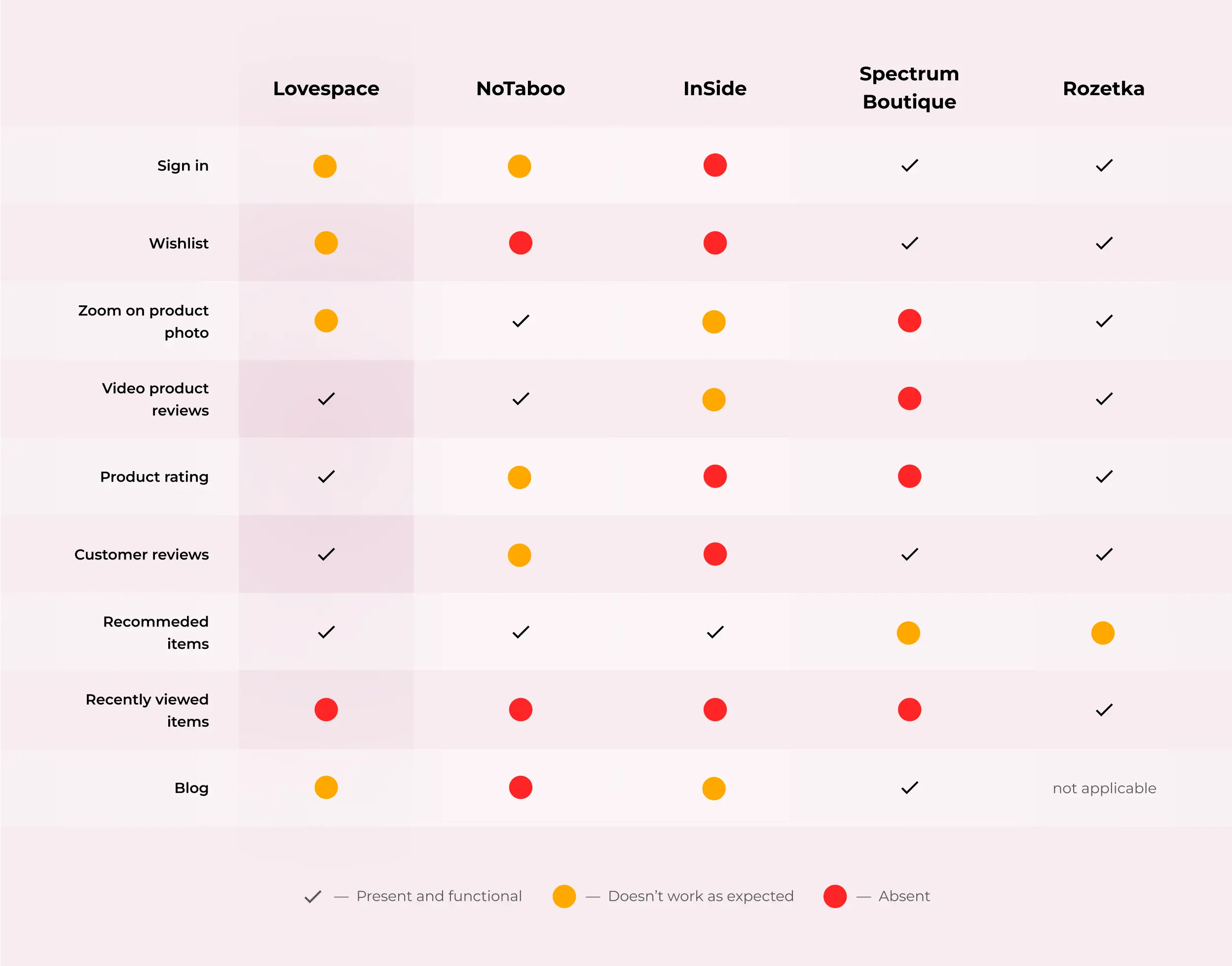
Our research analyzed both marketing and user experience, including local and international competitors. Also, we included huge Ukrainian e-commerce shops in our study because our users are probably already familiar with shopping on their platform and accustomed to the patterns used. Our analysis revealed that while Lovespace had many necessary features, they were not working optimally. Some key findings from our research include:
User testing
As we have seen exciting features working poorly, our next step was to conduct a usability study to determine what parts of current designs cause the most trouble to our users. This user testing was executed as a remote moderated study.

User testing highlights
Prioritizing
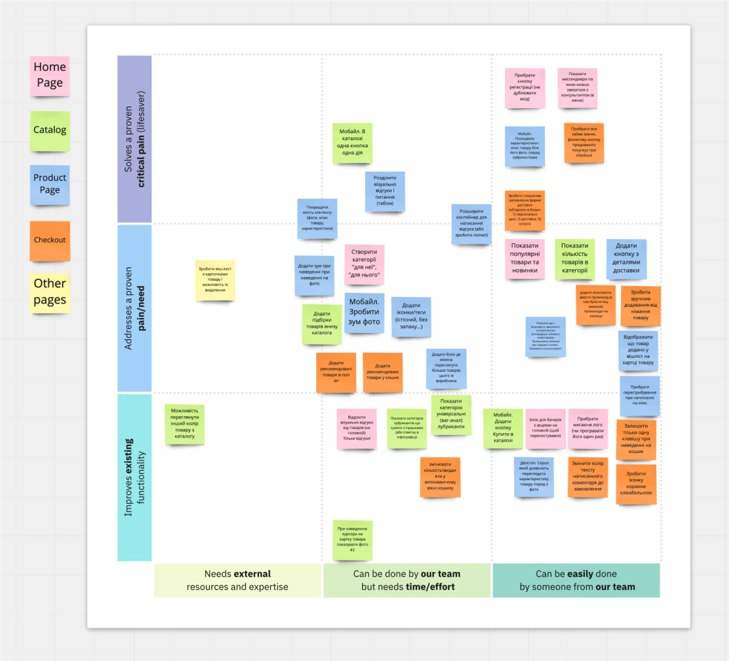
With the main user problems identified, we generated various solutions. To narrow down our options, we used the prioritization canvas to prioritize the most feasible solutions for the development team to implement.
Final designs
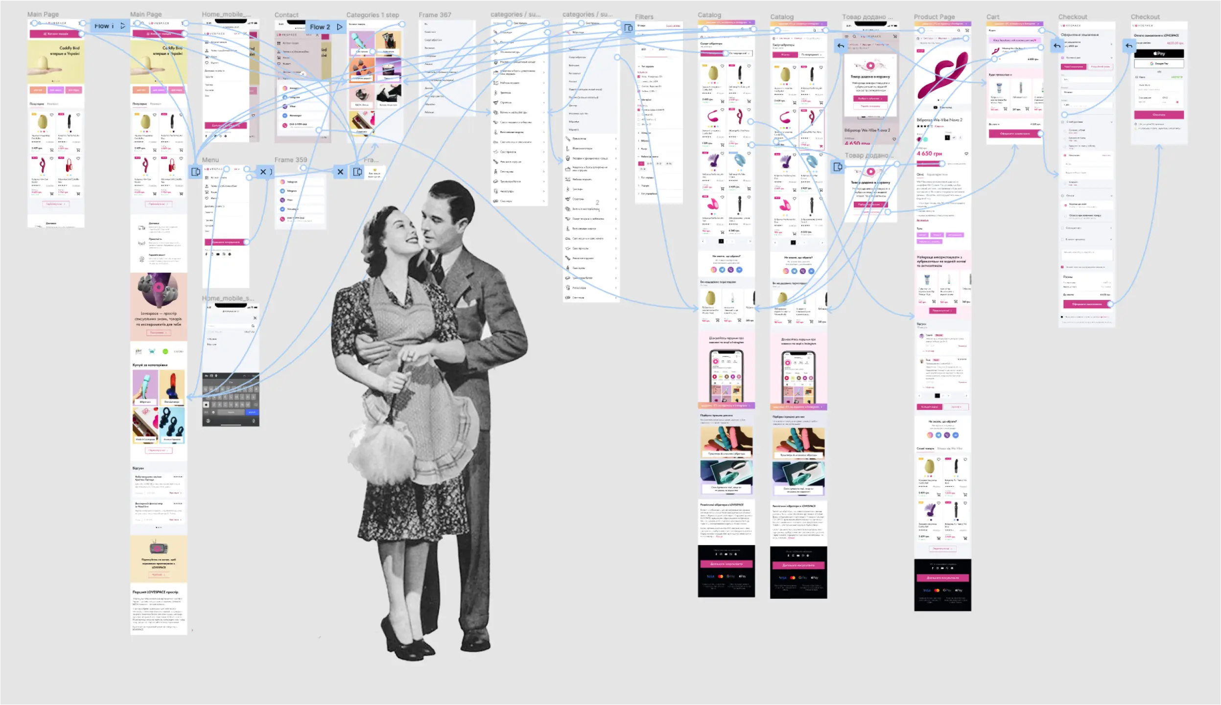
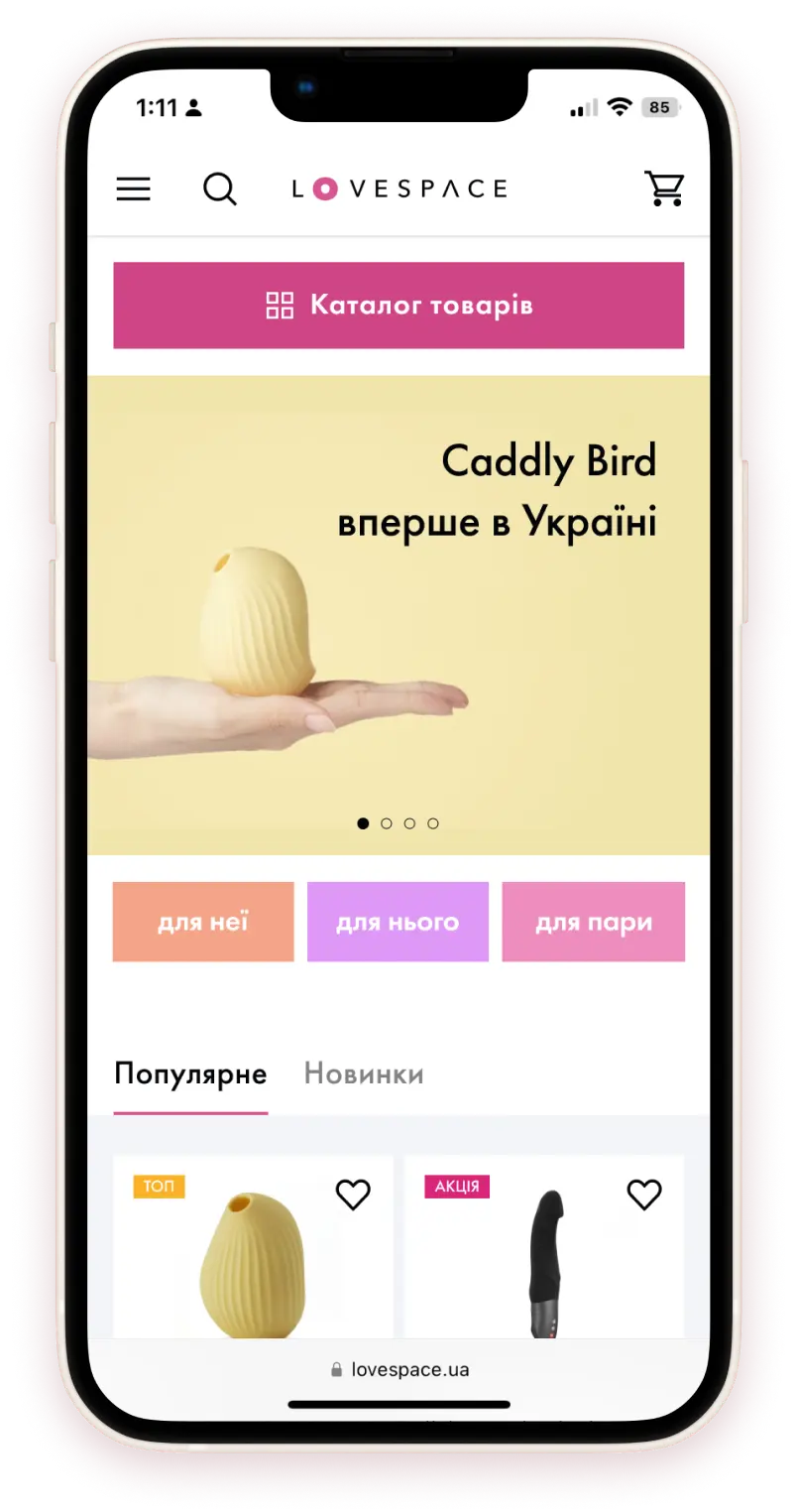
For the final designs, we aimed to enhance the site's existing style and make it match the look of Lovespace's Instagram page. The goal was to create a cohesive overall feel for the project.
We simplified the home page by removing excess advertising. To better serve new users, who account for 80% of Lovespace's profits, we added curated product categories "for her," "for him," and "for couples." Additionally, we highlighted popular products front and center to match user interest.
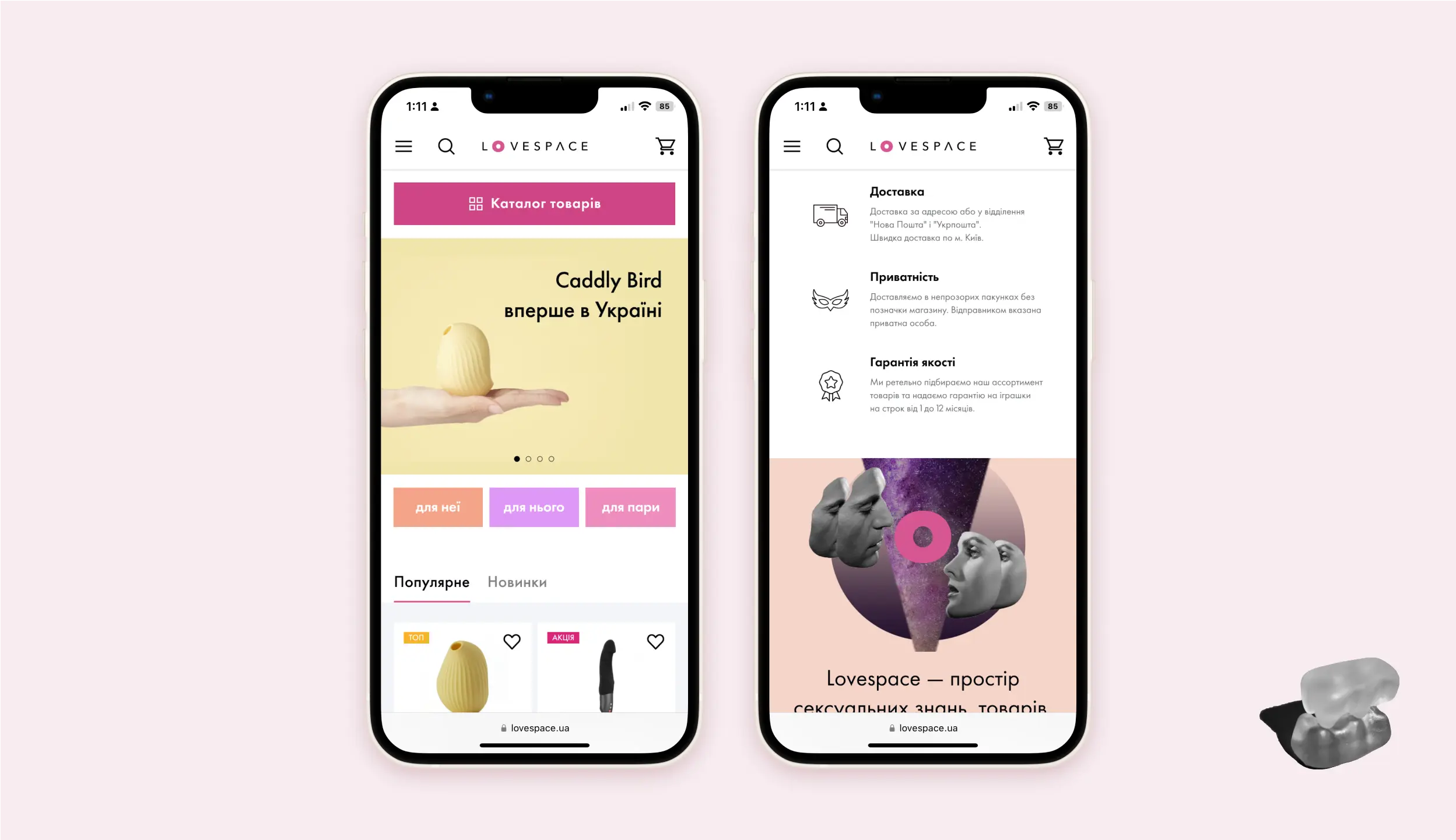
We added a dedicated section on the home page to provide more information about the delivery, privacy, and quality promise as users searched for it. Moreover, we highlighted the team behind Lovespace and their presence on Youtube and Instagram to boost brand trust and engagement with users.
We streamlined the navigation by simplifying the visual appearance of the menu while still including all subcategories. This made it easier for users to find what they were looking for.
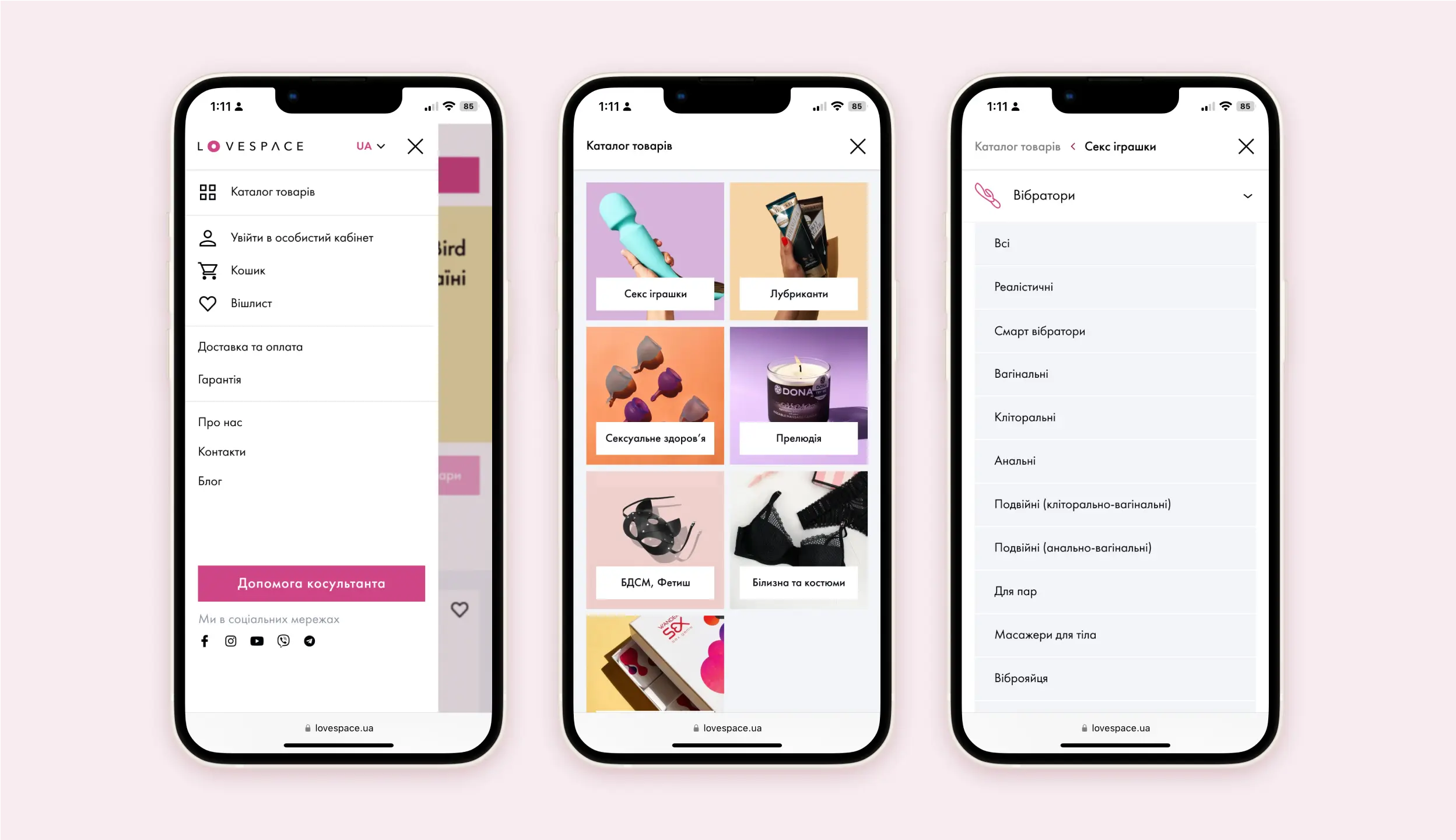
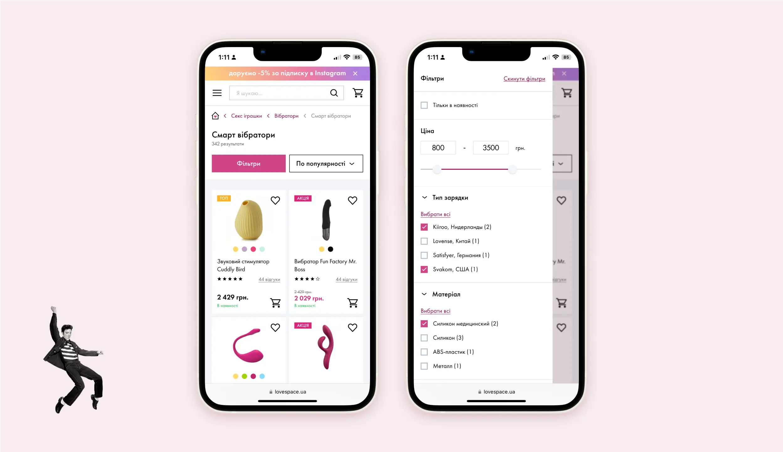
In the catalog, we simplified product cards to show only the most important info and added helpful filters. We also included a count of the items in each category, giving users a clearer idea of how many options they have to choose from and do they need to filter further.
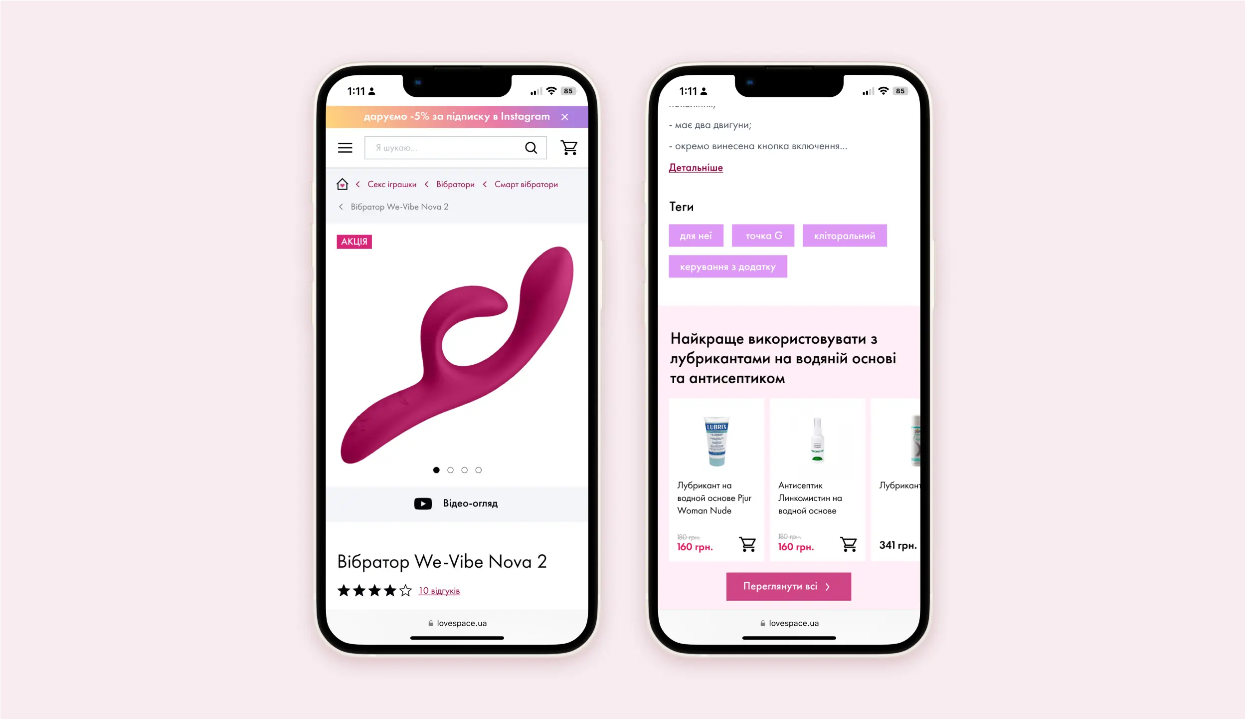
The product page was a key area of my focus during this project. Many users end up on this page directly from search engine results (especially if the product is rare on the Ukrainian market), and it's where they make their final purchase decision.
We improved the scrolling and zoom capabilities of product images on mobile devices and highlighted video reviews created by the team. In order to enhance both customer satisfaction and business revenue, we kept the lubricant upsell feature but moved its location to under the product description so it wouldn't distract users from getting more information about the product.
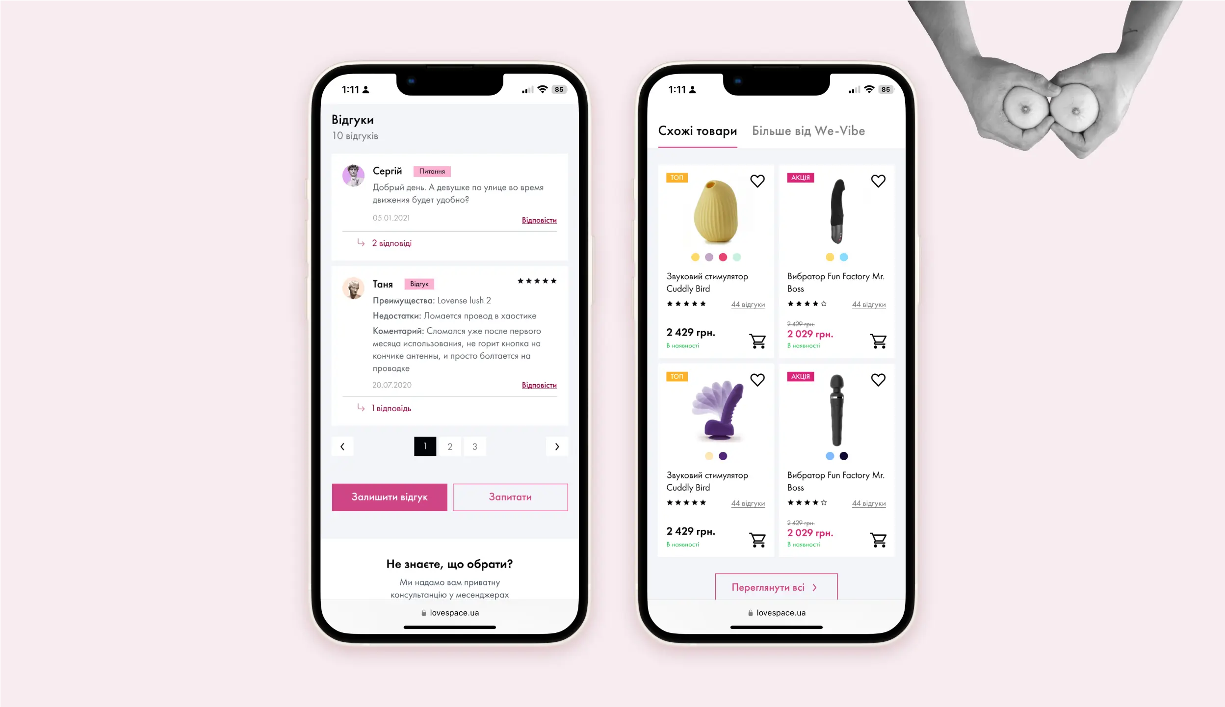
We found that product reviews were important to the Lovespace team, but caused confusion among users as they were mixed with questions. So we separated the two to avoid affecting the product's overall rating.
To help people make informed choices, we added a section with similar products and more offerings from the same manufacturer at the bottom of the page.
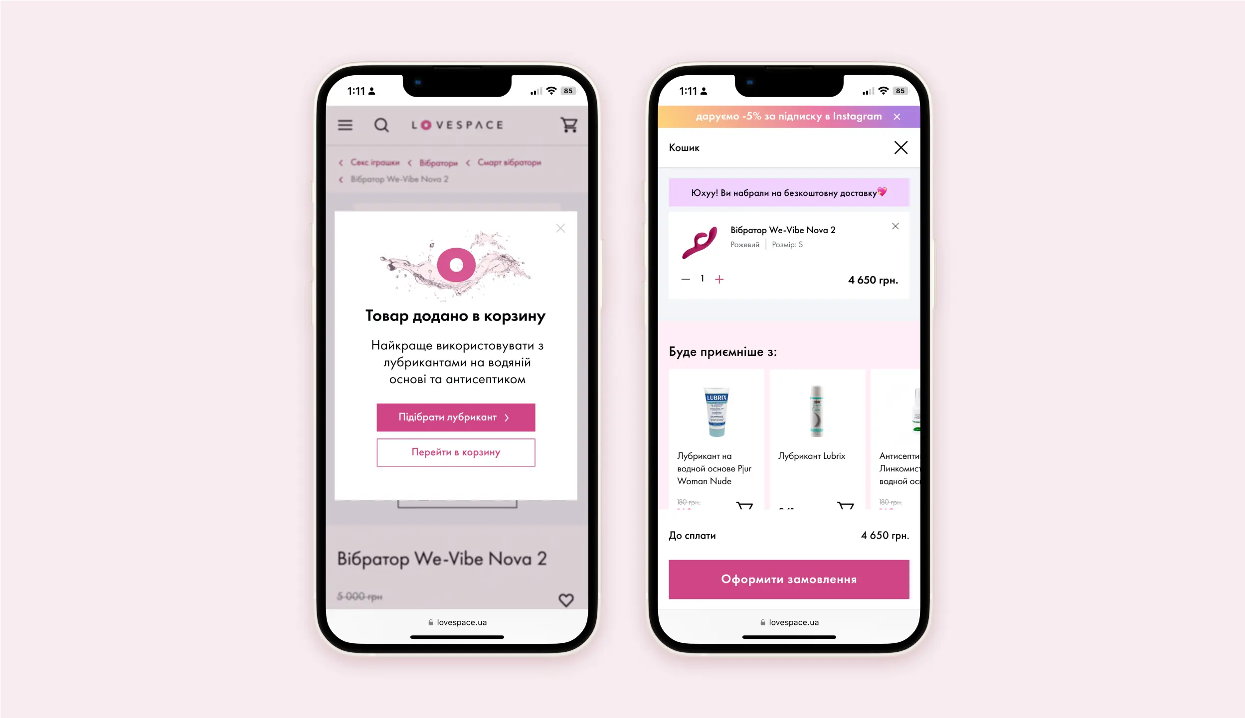
Later, we re-emphasize the importance of the lubricant in the pop-up window. We also left the option to add a lubricant directly in the cart.
Summary
It was a fun and challenging project to be a part of. I'm happy that incorporating user feedback helped improve the final outcome, and our stakeholders were pleased with it as well. I think it was important to prioritize the research findings since our client had a small development team. Working with my teammates was a great experience and I learned a lot from them. I also discovered a love for organizing teamwork and leading meetings.
A big shoutout to my fantastic design team: Tolko Kolom, Olesia Podokopna, Anastasiia Voievidka.
